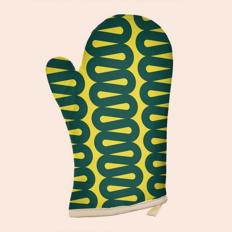
Sustainable.
We design unique and effective solutions for brands, people, and the planet.
Digital.
We design unique and effective solutions for brands, people, and the planet.
Physical.
We design unique and effective solutions for brands, people, and the planet.
Brand.
We design unique and effective solutions for brands, people, and the planet.
Environments.
We design unique and effective solutions for brands, people, and the planet.
Storytelling
We tell compelling stories uniquely.

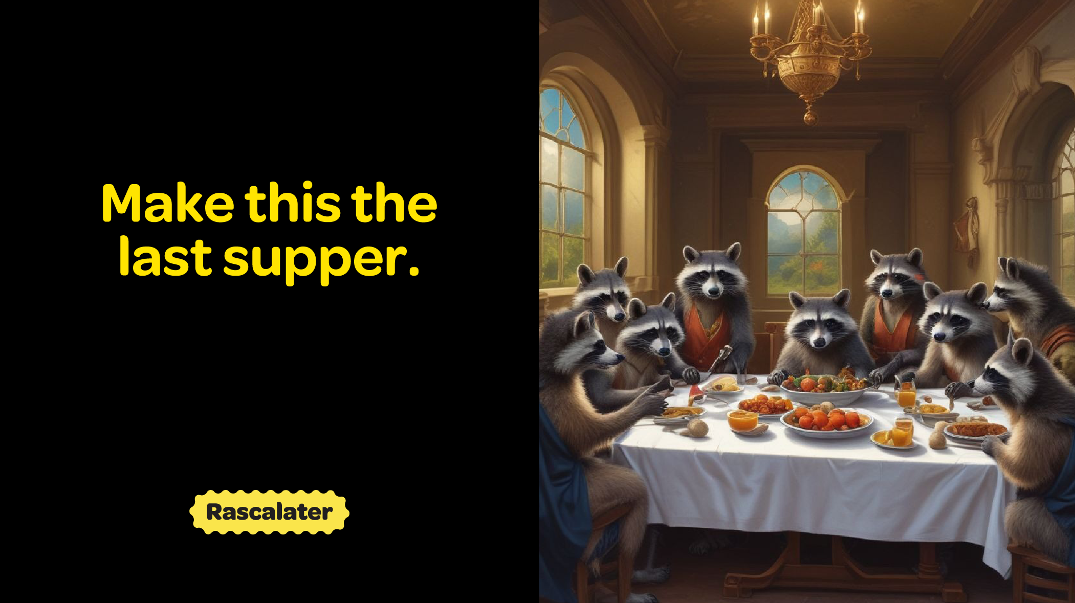
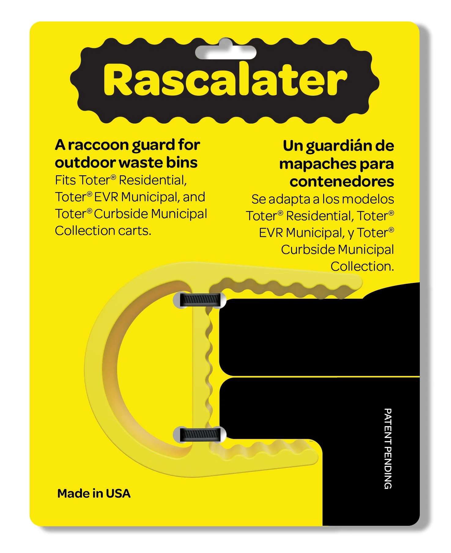
Rascalater
Keeping everybody happy can be a challenging but also fun task when that includes the homeowners, wildlife, and the community at large. Fully exploiting the expressiveness and intelligence of raccoons this balance of wildness and playfulness with utility is present in every aspect of the brand expression including the product design itself.
Brand Identity

Main logo style and alternative uses.
Product Design

Manufacturing & Supply Chain

Storytelling


Packaging
Web & Digital


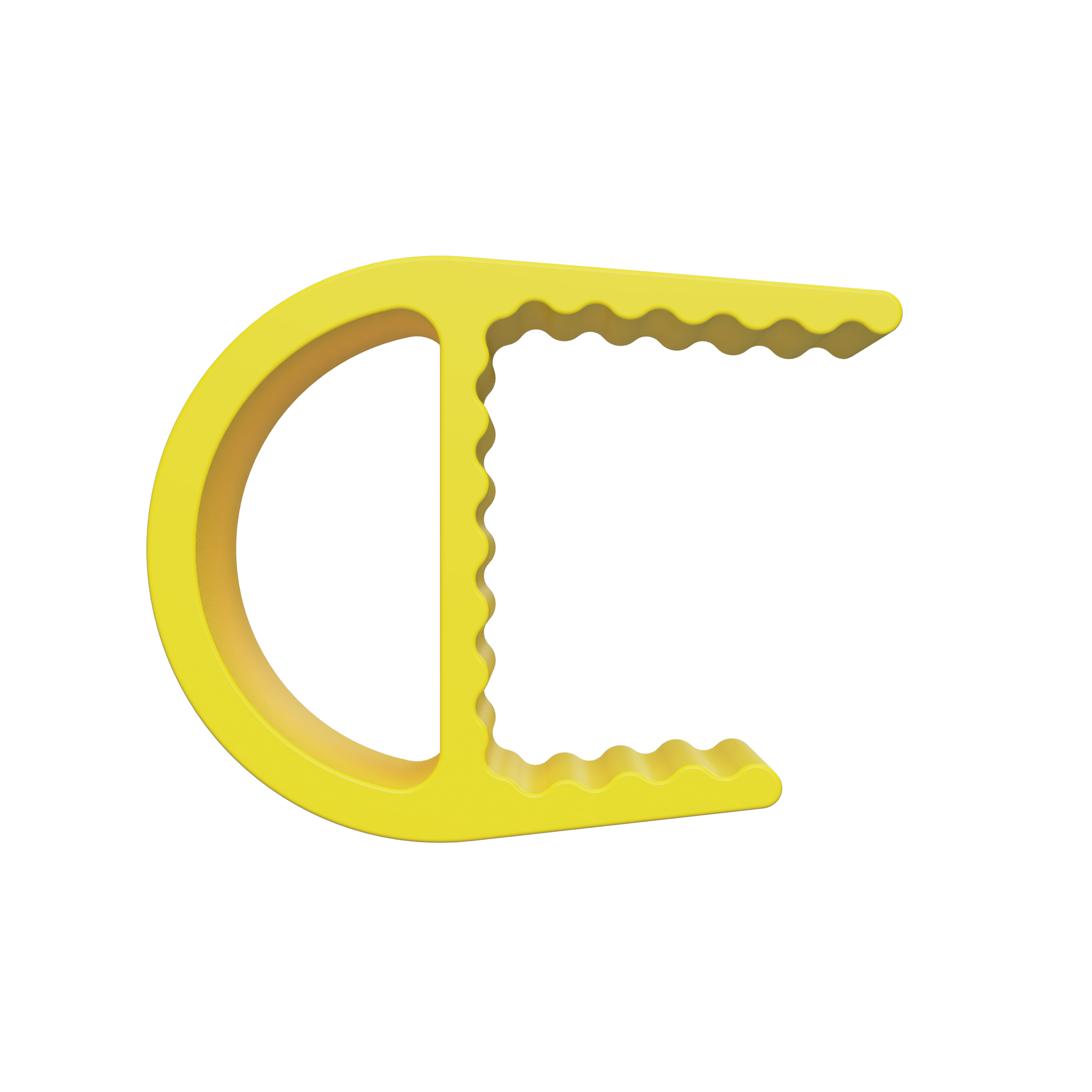
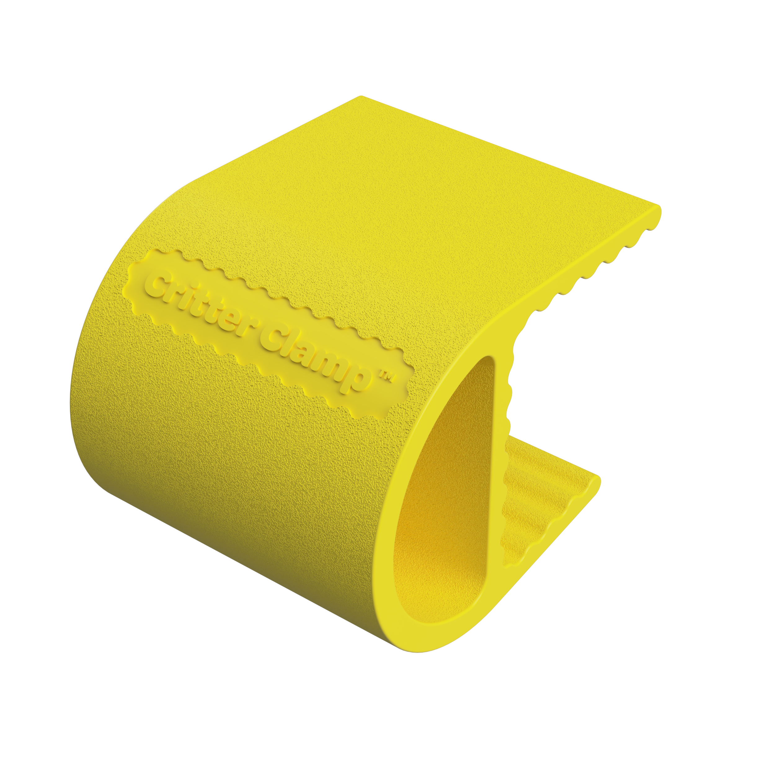
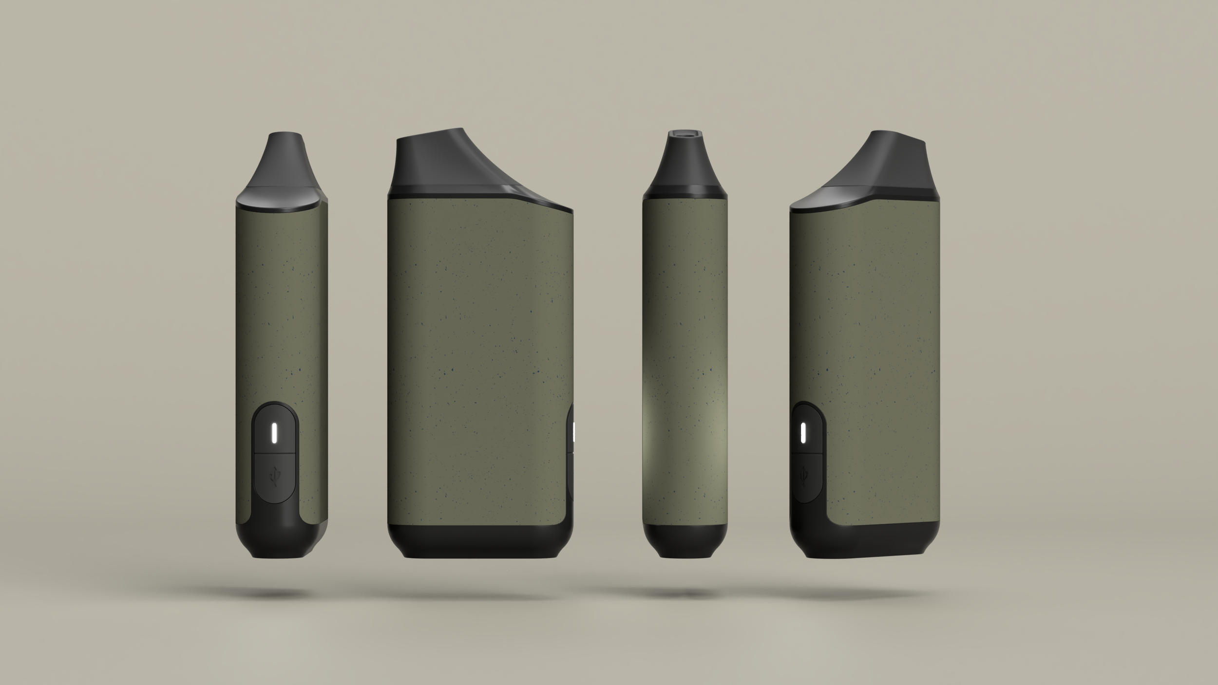
Mystic

Birds of the feather...
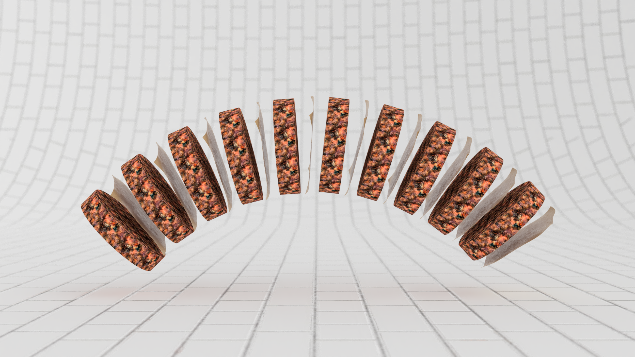
Atomize, not vaporize! This innovative engineering group working on an entirely new type of inhalant delivery platform that is completely heat (and therefore also waste) free and safer approached us with a familiar “design a thing around this” challenge. So, we looked at ways to break out of the tubular black monolith monotony dominating the market of combustion or near-combustion devices. And went back to the Beginning for inspiration to the first tools humanity fashioned for themselves,
Key Visual Themes

Organic

Tubular
Ideation


Generations

Generation X
2nd Generation


Third Generation

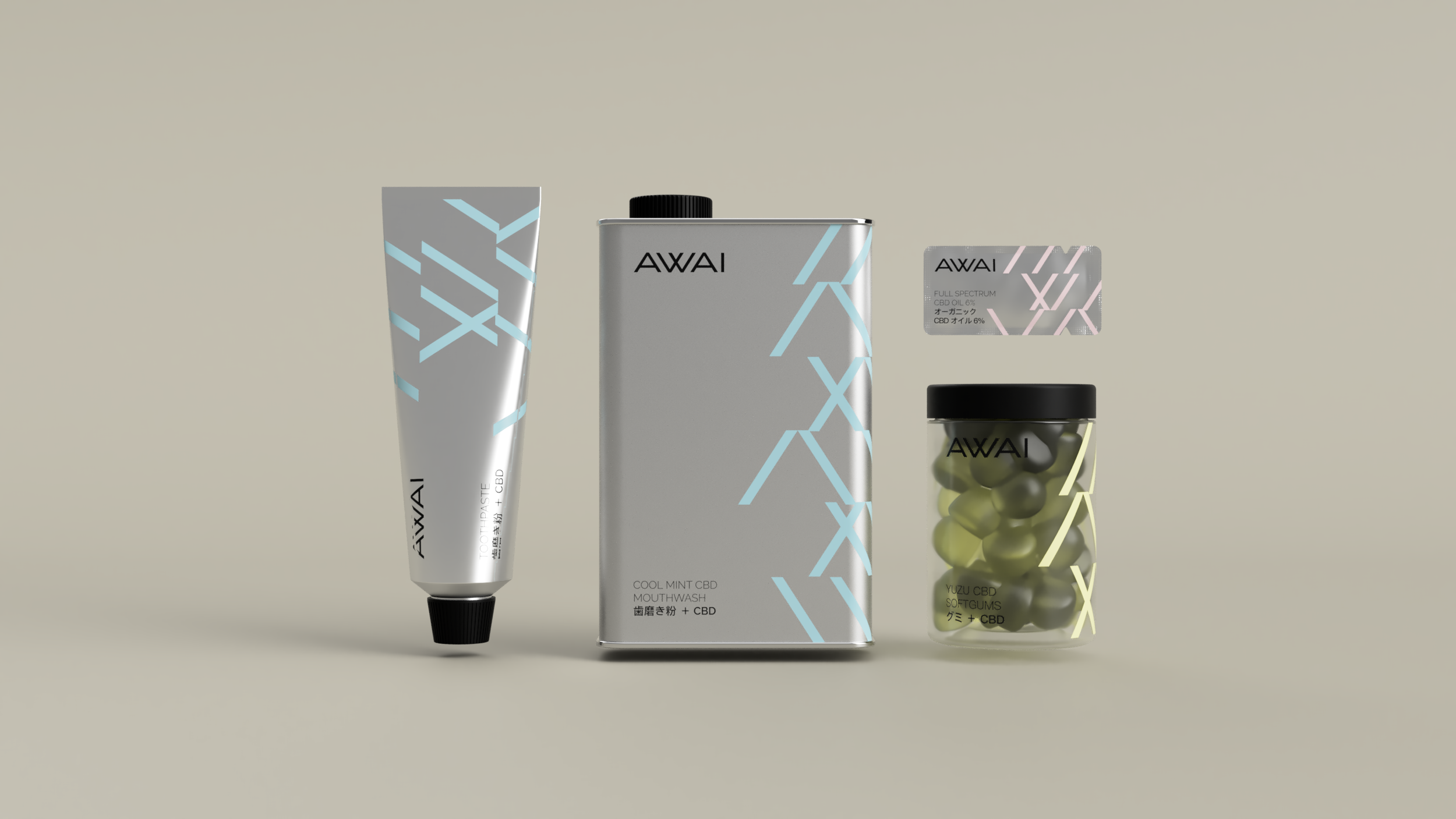
Awai

An angular, choppy stroke pattern evocative of Japanese traditional brush calligraphy is a time capsule containing the heritage of the brand.
Print Stationery

Oral Care & Supplements


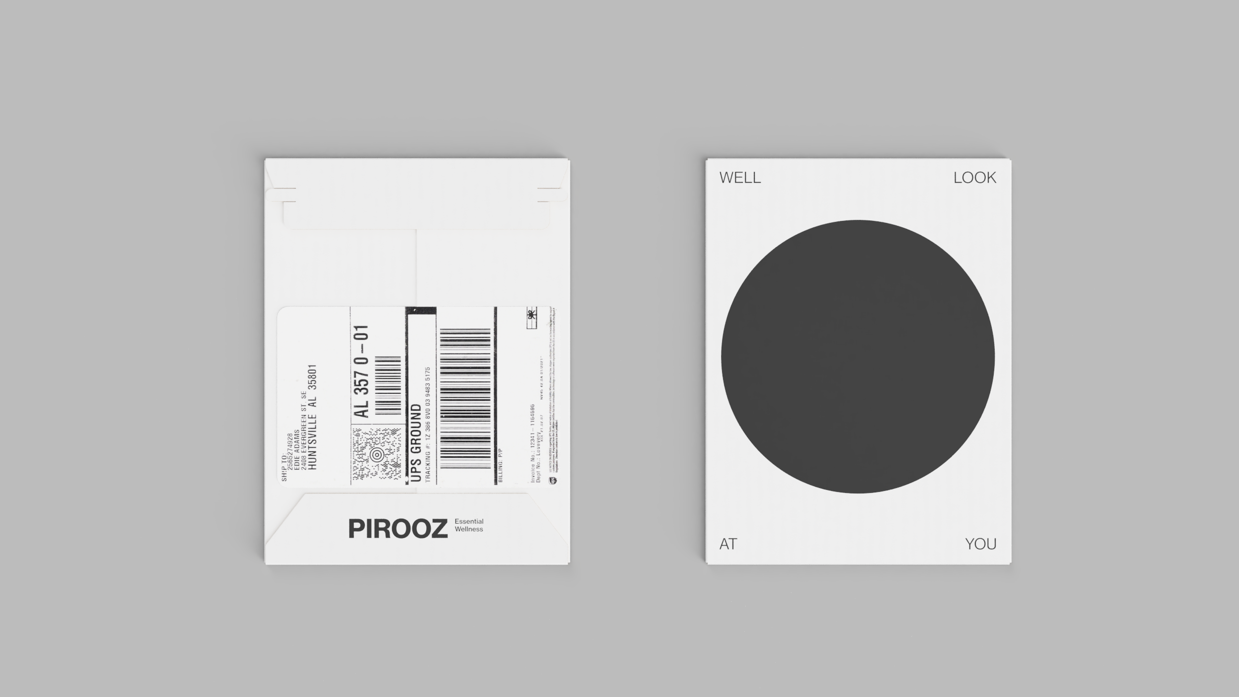
Subscription Mailer.
Skincare


Trade Show Booth


Keeping the brand consistent across ALL the touch points.


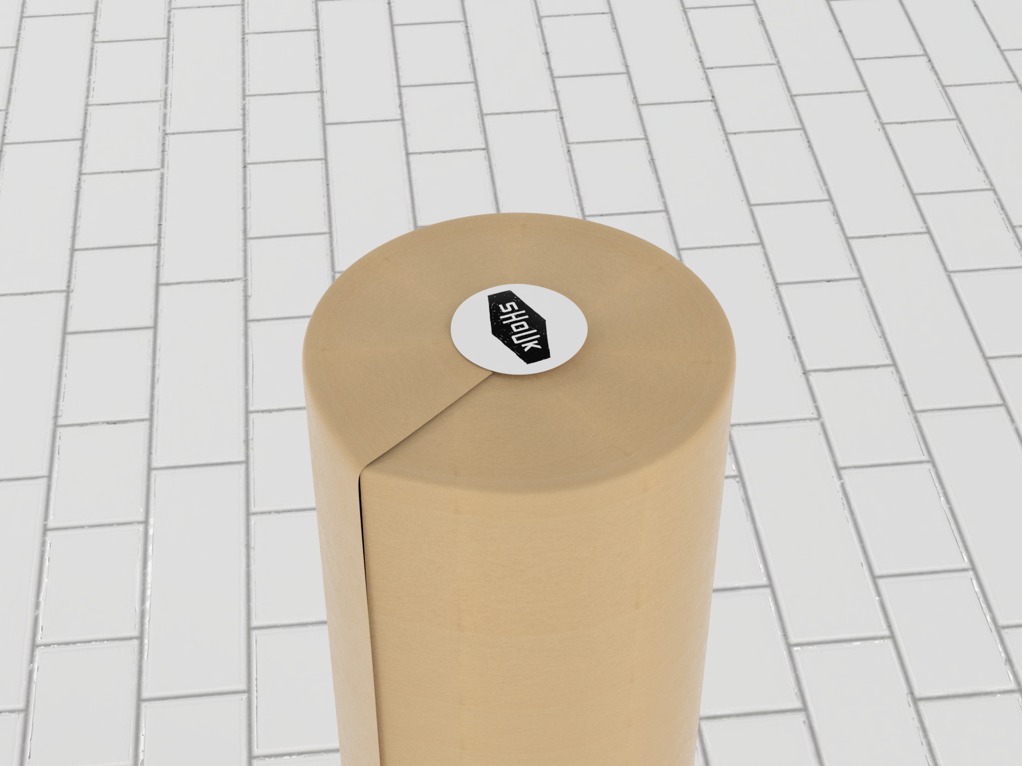
Shoukburger
We collaborated with our old friends at Shouk to come up with branding and a 100% compostable multi-functional packaging system for the now legendary pre-cooked frozen vegetable patties they refer to as Shoukburgers. Just in time for the meatless burger wars. Then again, we’re convinced that once you taste them there will be peace at last. Unlike meat-substitute or conventional veggie burgers, a Shoukburger is moist and beefy while made 100% from minimally processed vegetables, mushrooms, and other things you can pronounce, and with a satisfying flavor profile that is true to its Israeli street food roots.
The inspiration board.
The logo is derived from the Shouk logo but with a clear goal of communicating the nature and physical volume of the product. The idea of stackability is built into the visual language as much as into the form and function of the packaging system.

An actual Shoukburger. Yep!

Rather than wrapping each patty individually in an attempt to prevent the onset of freezer burn, we arrived at a delightfully simple solution inspired by frozen beef hamburgers.
Introducing a single membrane vis a vis a breathable paper wrapper allowed us to arrive at a solution that is elegant, on-brand, fast and inexpensive to implement at scale or in a more limited capacity.


The pulp cylinder system is durable enough to withstand direct to consumer shipping and stands out exceptionally in the retail display.


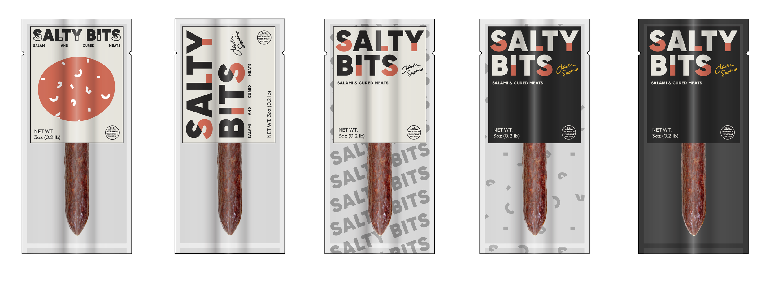
Salty Bits
It started with pork and became a whole lot more. We helped create distinctive and effective packaging for the world’s most expensive sausage made by hand in Pittsburgh, PA.


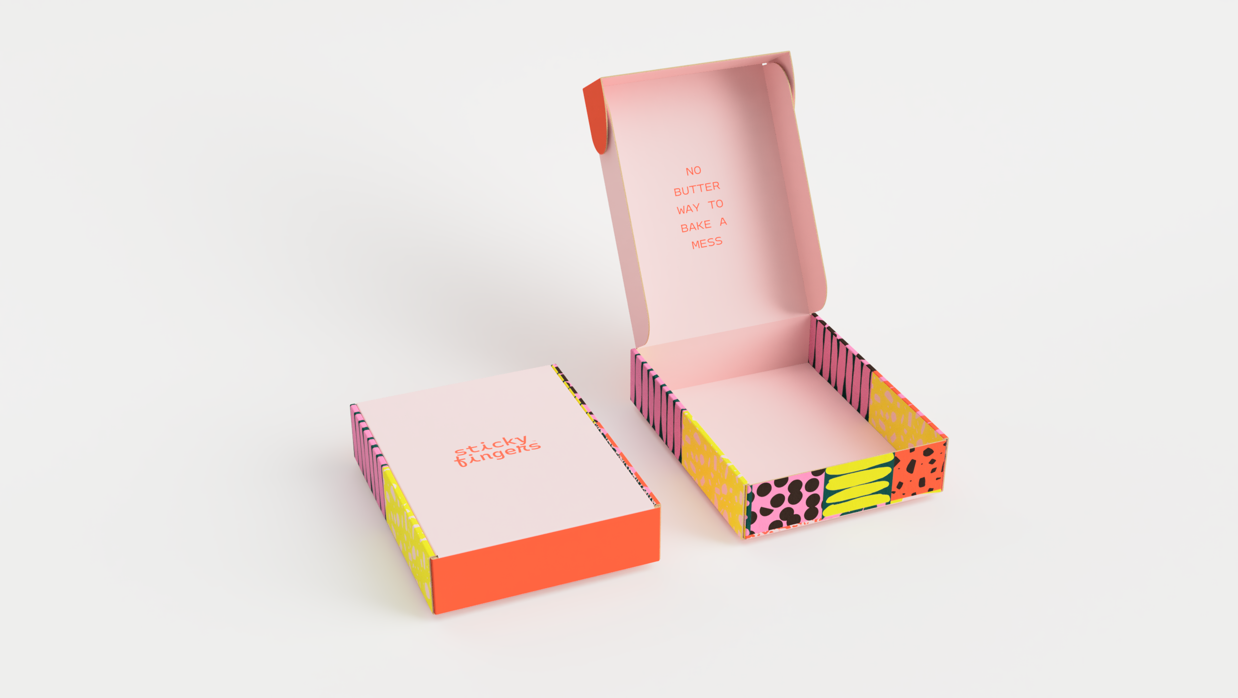
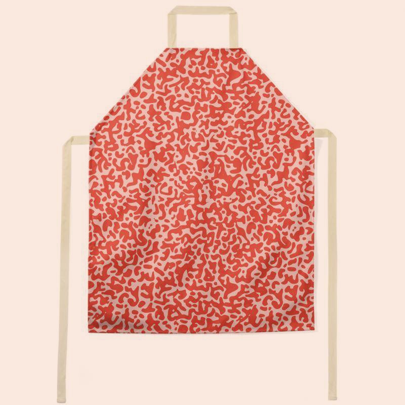
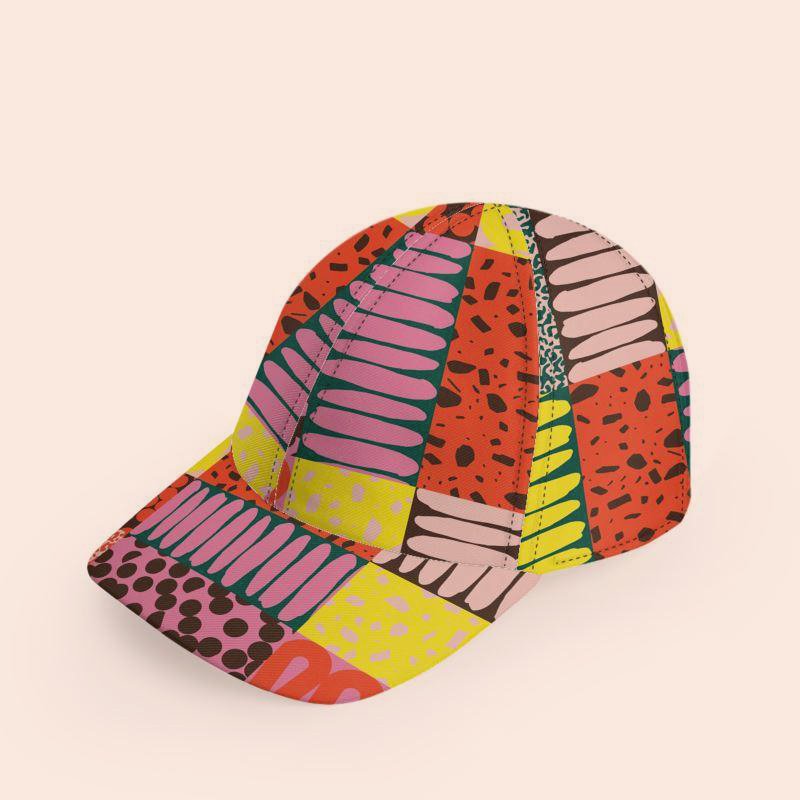
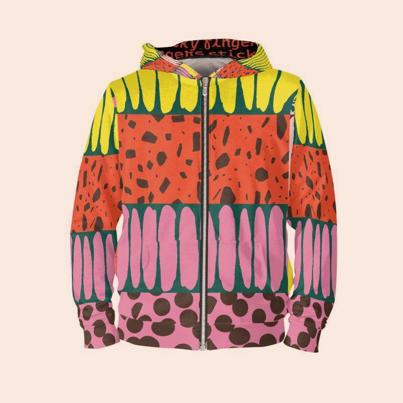
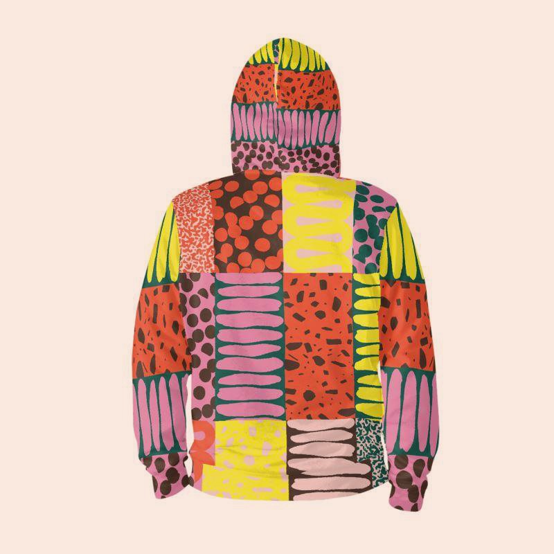
Sticky Fingers
“No butter way to bake a mess” is what we said when we first accepted the opportunity to create a foundation for the next level of growth for a legendary DC-area vegan brand founded by reality baking celebrity Doron Petersan.
Together, we re-imagined Sticky Fingers as a unified and highly visual but also coordinated offering of products and services offered some offered only locally and others nationally, some online while others in brick-and-mortar settings. This means we truly began from scratch.
Starting from the joyful color scheme and friendly typography style the resulting image is accessible, fun, playfully humorous, and inclusive in presentation and tone with an emphasis on delivering bespoke-like luxury and superior performance all while reducing waste and increasing compostability and compatibility with local recycling stream.
Visit the Bakery Website
Visit the Diner Website


A palette that doesn’t take itself too seriously and vibrant graphic patterns that map to product categories work together to create a quirky but accessible DIY mood.


The flexible pouch is a high-resolution medium with a relatively low waste profile. 100% recyclable and modular by design.


Wholesale multi-packs.

The “hat box” for gifting and kits.
A branded mailer system.
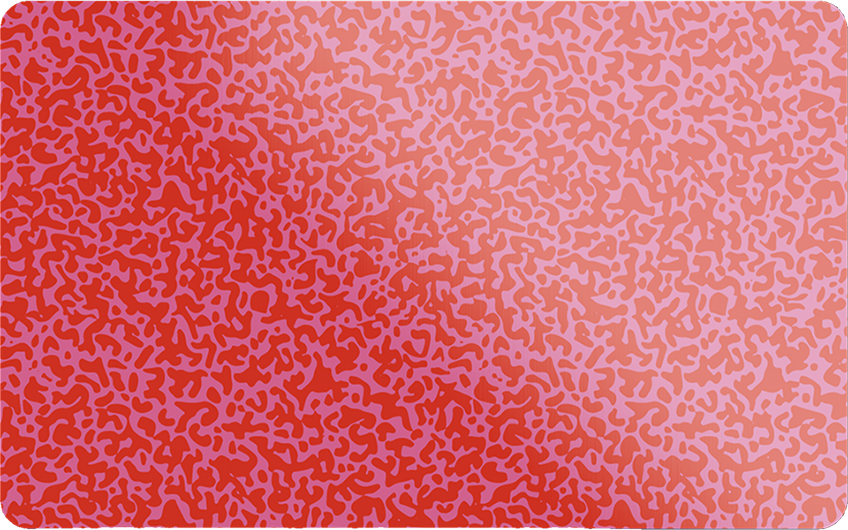
The Sticky Card gift card.


Printed collateral system evokes the nostalgia of old-timey postcards.

Holiday gifting kits. And more!


Qixo
Branding, UX, and UI prototyping for frictionless fantasy gameplay. Inspired by the love of the game, designed with global user base in mind.
The monogram puts everything into context.

Simplified, horizontal form of the brand mark.

Differentiation by color.

Brand elements used in a social media campaign context.


Logged in user.

C3
Introducing the C3 - a Curcumin, Crocus, and CBD Complex. This extraordinary new food supplement with vitamins, choline, minerals, and plant extracts is made by Kannaswiss - a cannabis innovator from Switzerland.

In order to maximize visual and storytelling impact, we devised a solution inspired by the marriage of the naturally occurring color spectrum with the wellness-enhancing promise of “flowing” through one’s day to arrive at a 360-degree labeling solution. The result is effortlessly Swiss while remaining fresh.


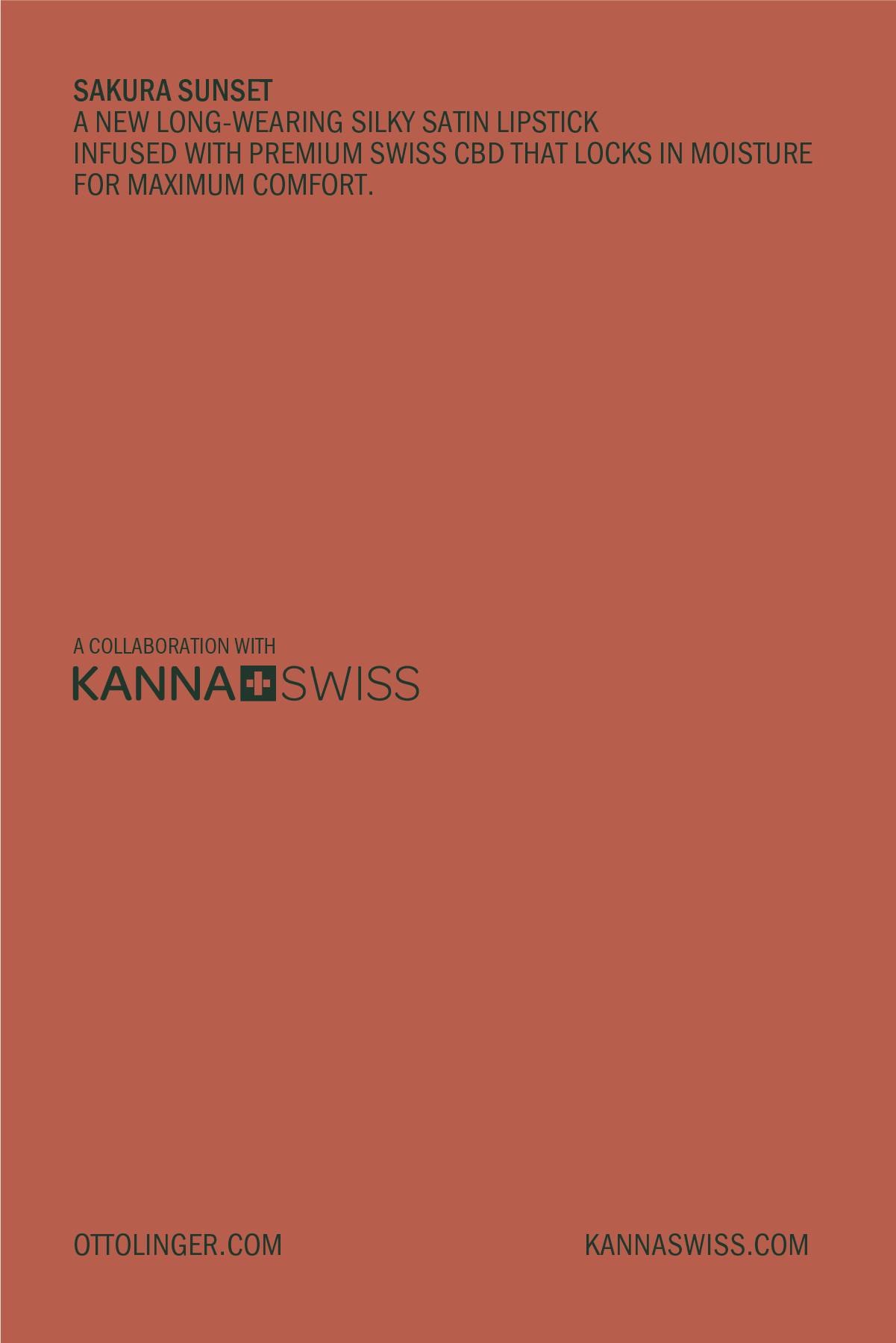
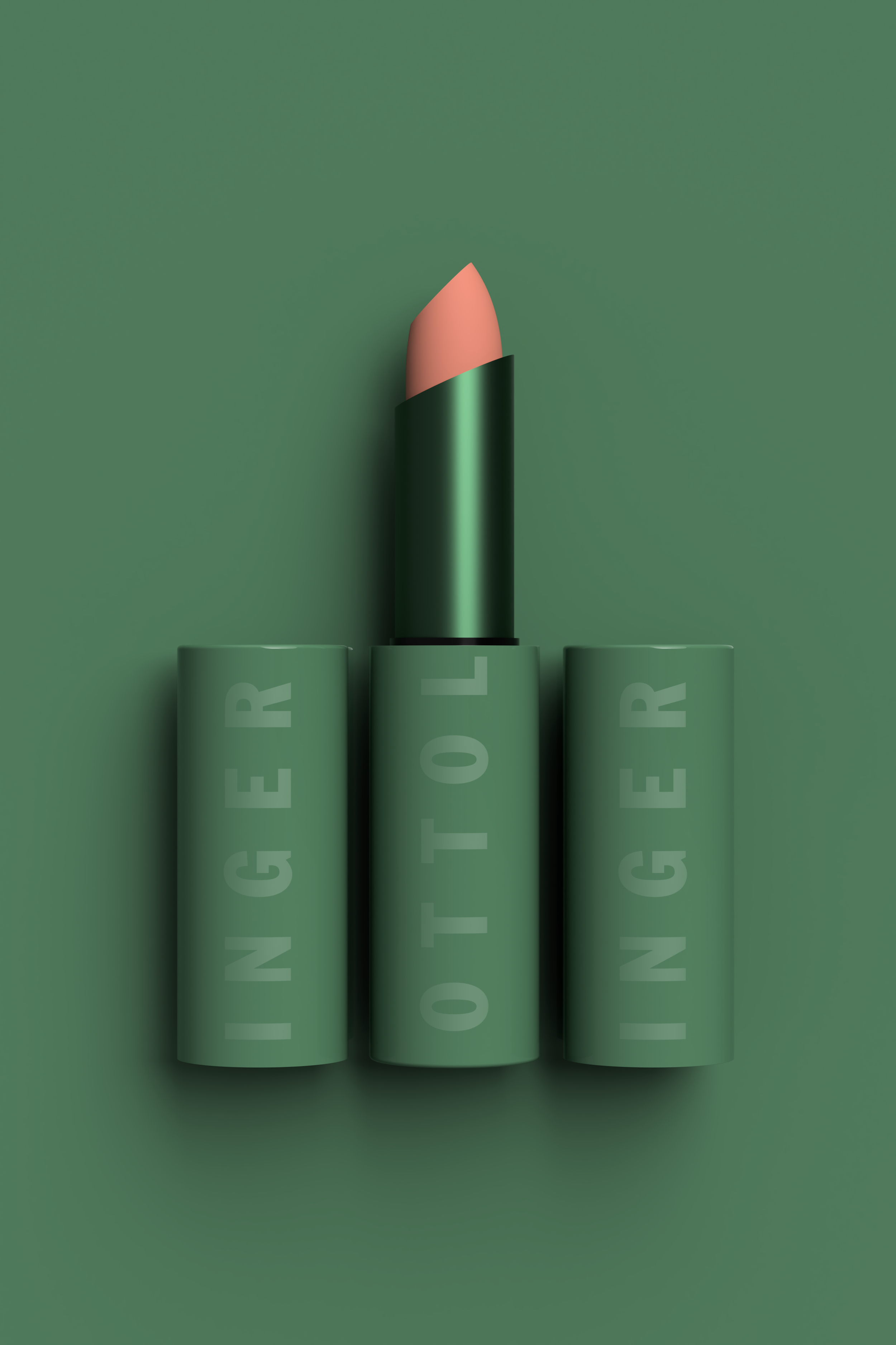
Ottolinger + Kannaswiss
In another first, we created a Swiss premium CBD-infused lipstick for an exciting Ottolinger + Kannaswiss collaboration. Launching at Paris Fashion Week this fall during the Ottolinger SS 20 collection show, the long-wearing silky satin lipstick comes in Sakura Sunset and is inspired by the post-apocalyptic punk heroine Tank Girl.


OX
Nanoxidil-powered hair styling and scalp care kit for men. Virility, vitality, volume. Stylish, professional grade tools for everyman’s bathroom. Not your dad’s hair club.

Excerpts from the design brief.


A name and identity system that speaks volume, speed, and professional power.

Bold, not bald.

Complete care kit.

Kannaswiss
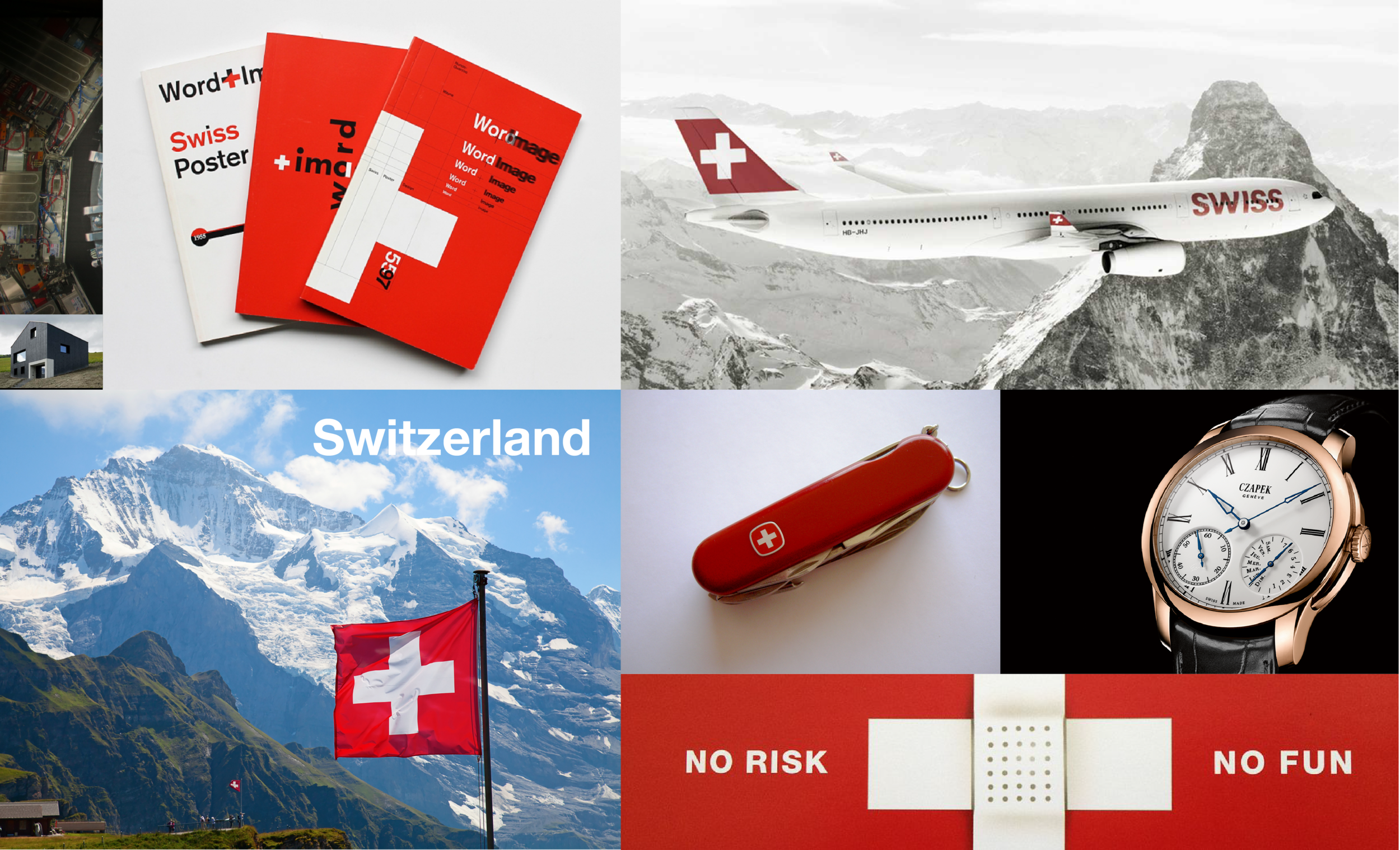
Haloing off the Swiss school of modern graphic design we forged an identity that is at once accessible and inviting while also being reliably “pharmaceutical” in order to communicate the brand’s promise and the related value system and the premium price positioning of their expanding line of CBD-enhanced products.
An excerpt from the design brief.

Wellness is central to the brand promise.


The “plus” monogram device is loaded with meaning.

Subliminal promise of comprehensive lifestyle support implied and expressed.

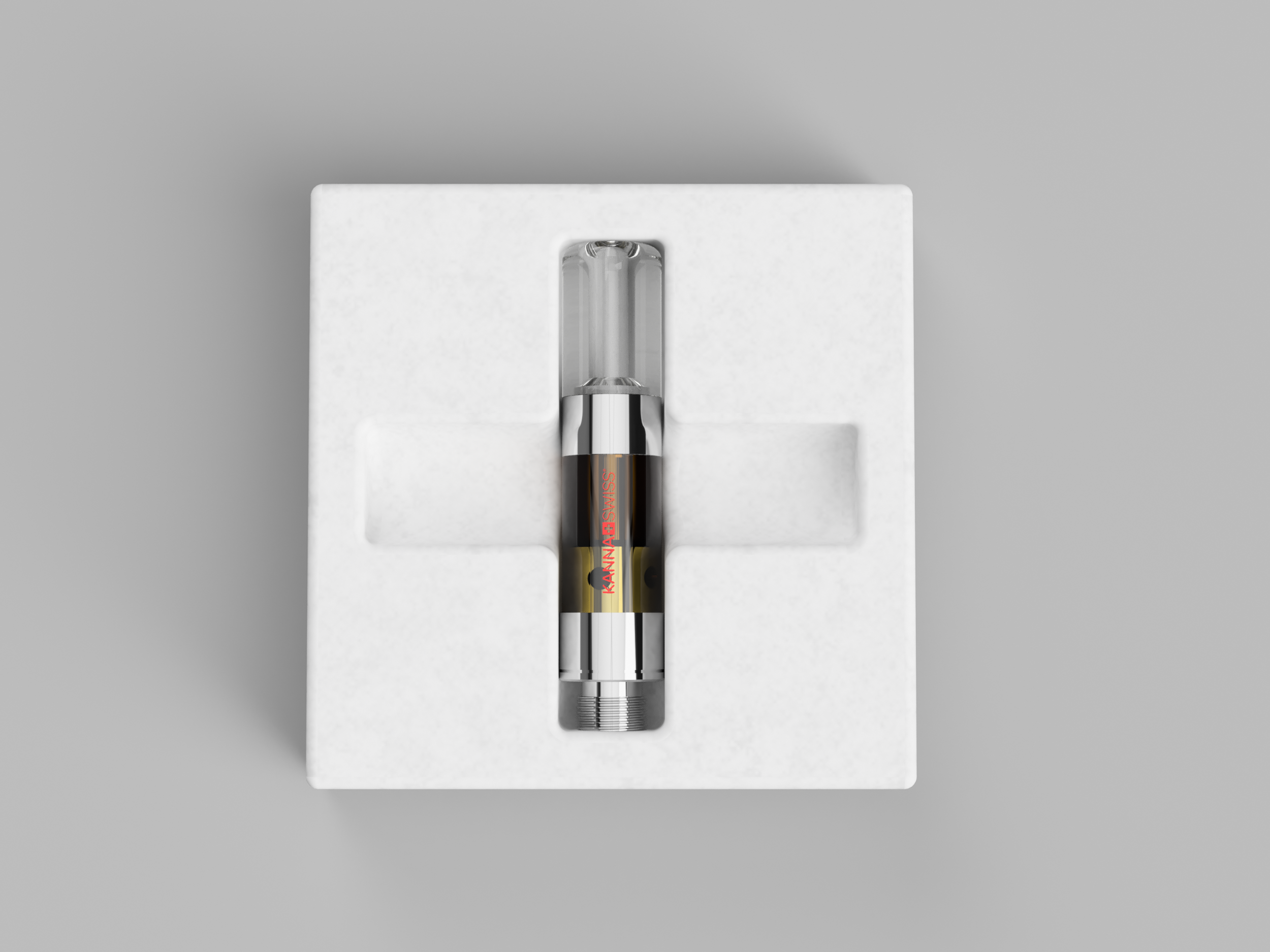
The first SKU that launched the medicinals category.

An ever-expanding number of SKUs.
Bagasse fiber mesh molds echo the values of the brand.

Attention to detail is endemic.

A custom mold for the most Swiss of all chocolates.

Retail facade elevation prototype reinforces the underlying Swissness.

Modular expo system that packs flat for a life on the road.

Comfortable, functional and modern.

Reusable totes from organic jute.
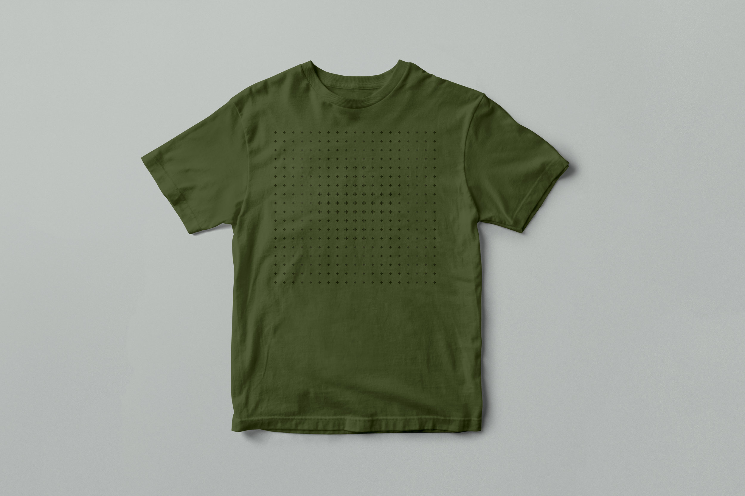
Organic cotton tees.

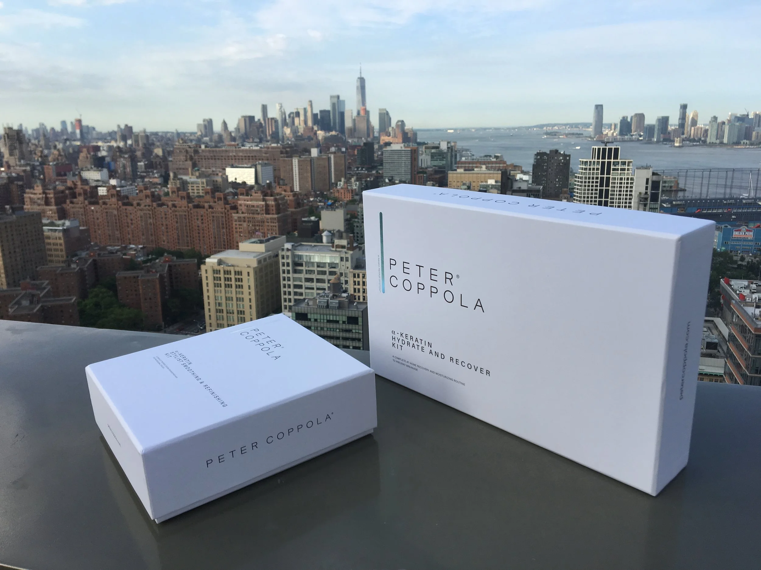
Peter Coppola
Let's iron things out wit this new straightening iron from Peter Coppola - a Personal Brands brand.

And redesign of the entire line followed.