Sustainable.
We design unique and effective solutions for brands, people, and the planet.
Digital.
We design unique and effective solutions for brands, people, and the planet.
Physical.
We design unique and effective solutions for brands, people, and the planet.
Brand.
We design unique and effective solutions for brands, people, and the planet.
Environments.
We design unique and effective solutions for brands, people, and the planet.
Storytelling
We tell compelling stories uniquely.

Shoukburger
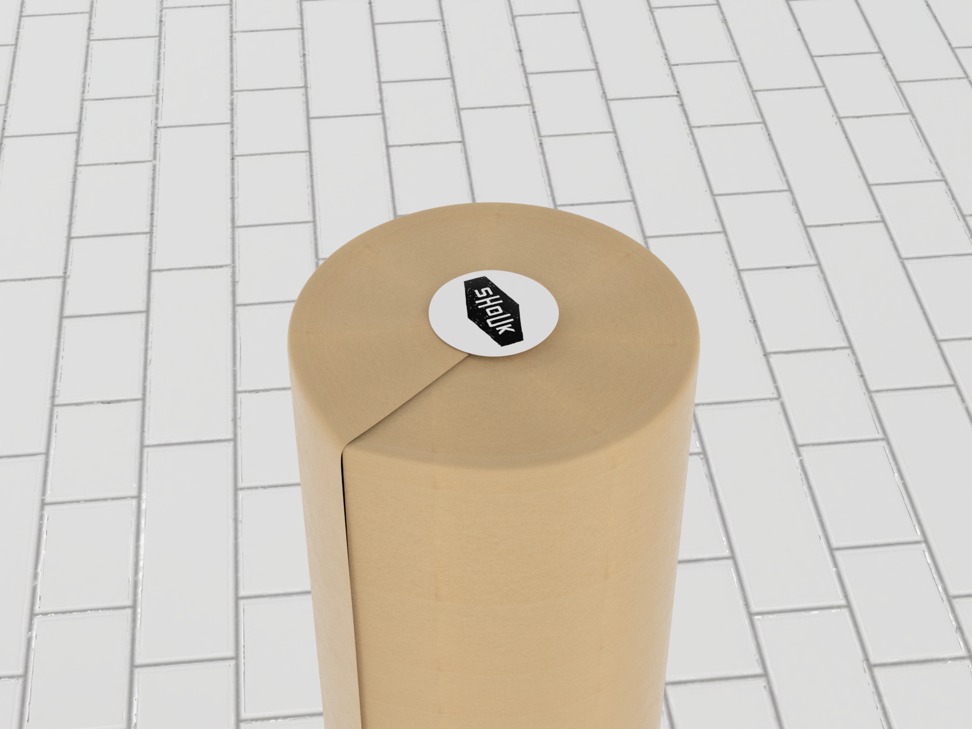
We collaborated with our old friends at Shouk to come up with branding and a 100% compostable multi-functional packaging system for the now legendary pre-cooked frozen vegetable patties they refer to as Shoukburgers. Just in time for the meatless burger wars. Then again, we’re convinced that once you taste them there will be peace at last. Unlike meat-substitute or conventional veggie burgers, a Shoukburger is moist and beefy while made 100% from minimally processed vegetables, mushrooms, and other things you can pronounce, and with a satisfying flavor profile that is true to its Israeli street food roots.
The inspiration board.
The logo is derived from the Shouk logo but with a clear goal of communicating the nature and physical volume of the product. The idea of stackability is built into the visual language as much as into the form and function of the packaging system.

An actual Shoukburger. Yep!

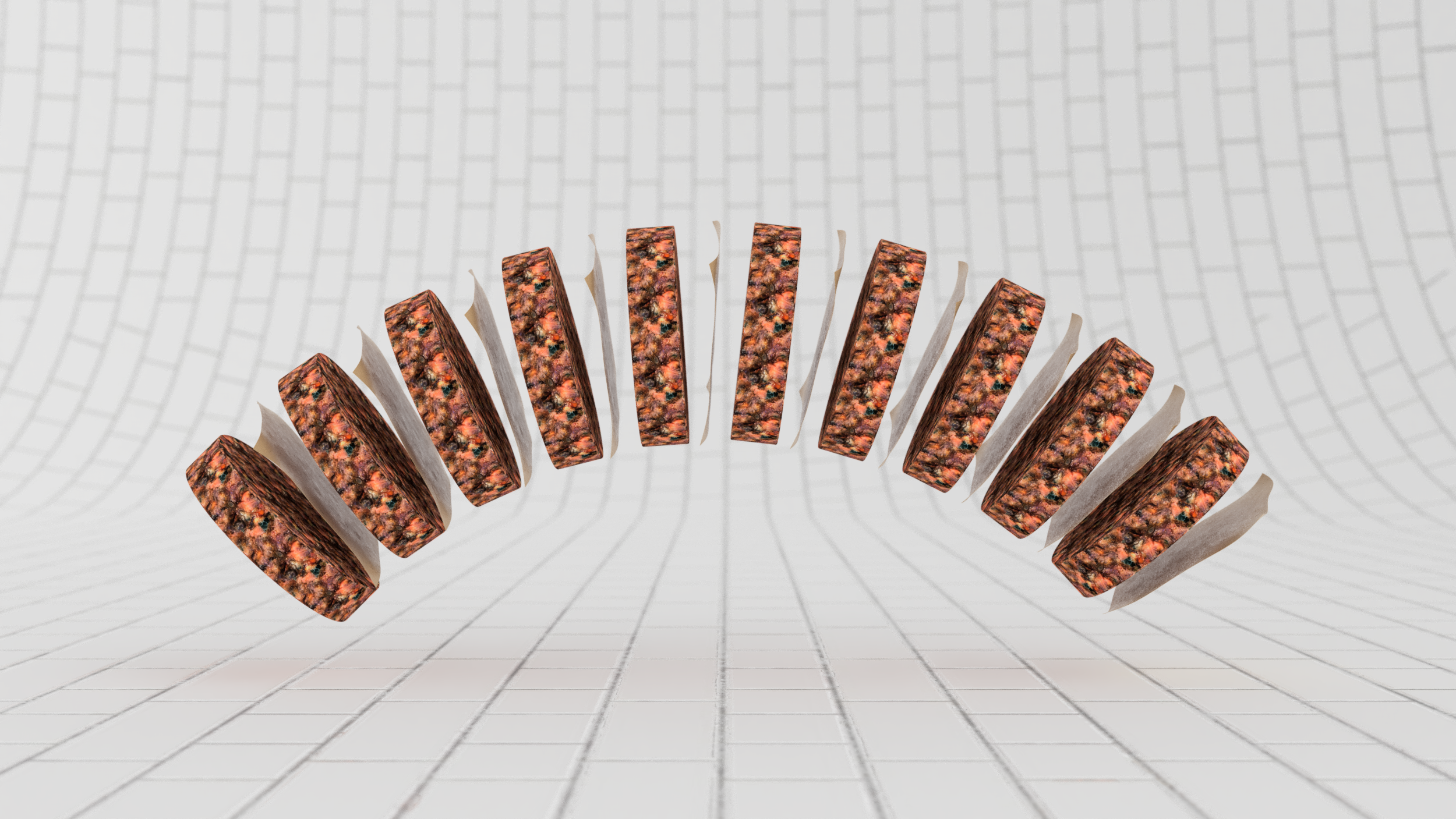
Rather than wrapping each patty individually in an attempt to prevent the onset of freezer burn, we arrived at a delightfully simple solution inspired by frozen beef hamburgers.
Introducing a single membrane vis a vis a breathable paper wrapper allowed us to arrive at a solution that is elegant, on-brand, fast and inexpensive to implement at scale or in a more limited capacity.


The pulp cylinder system is durable enough to withstand direct to consumer shipping and stands out exceptionally in the retail display.


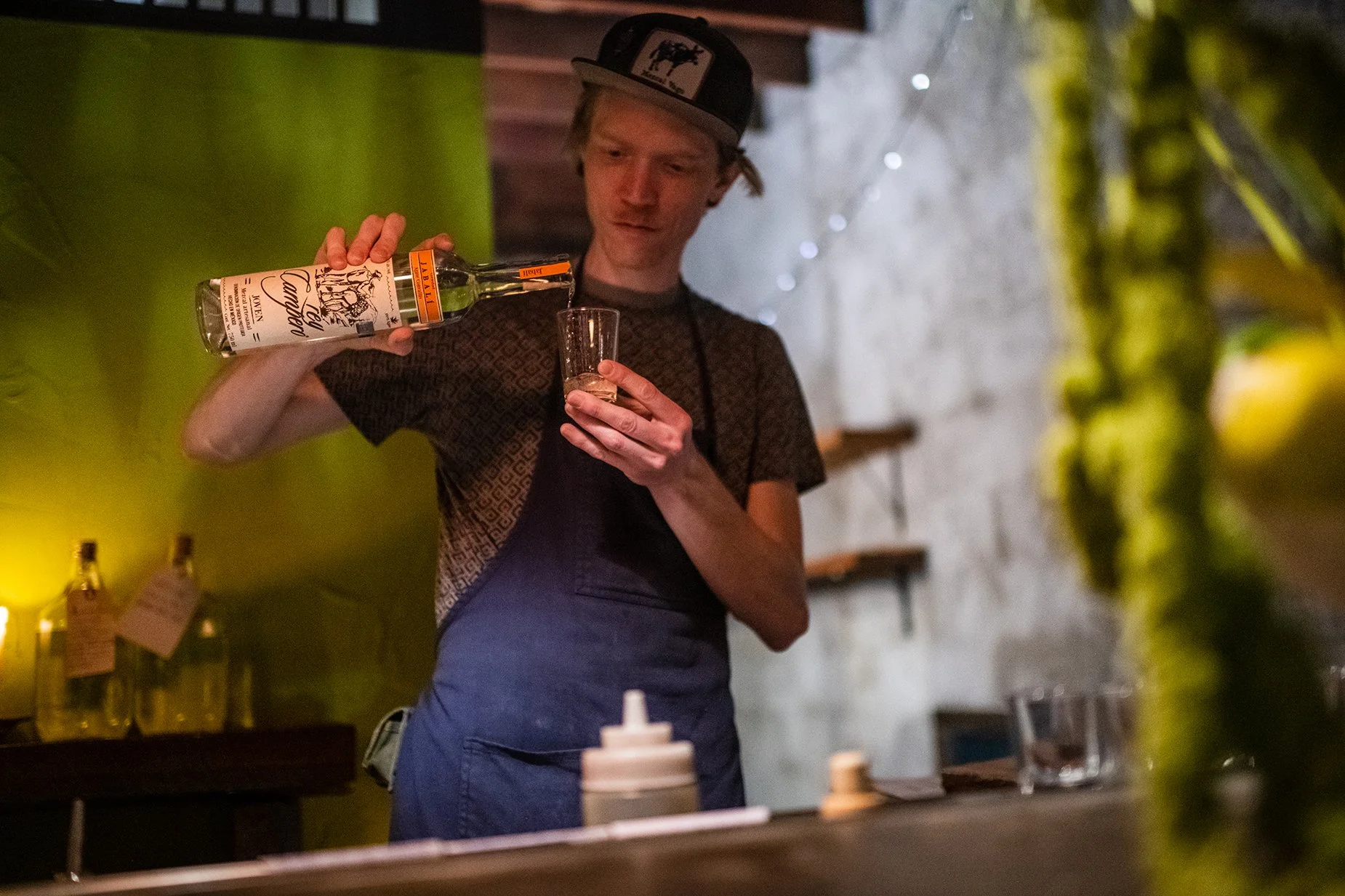
Awamoritime
Once upon a time, in a kingdom far, far away a beverage was born from exotic ingredients. Introducing Awamori to North American audiences as a versatile alternative to Sake, and Okinawa as a unique and special destination within Japan were the key requirements of the brief.
The Inspiration


Okinawa is one of the planet's so-called "blue zones" where people regularly live to a very advanced age.
Brand Identity
The brand's icon is a custom-designed Shisa dragon symbol that draws directly from the Okinawan folklore.
Storytelling


Web & Digital


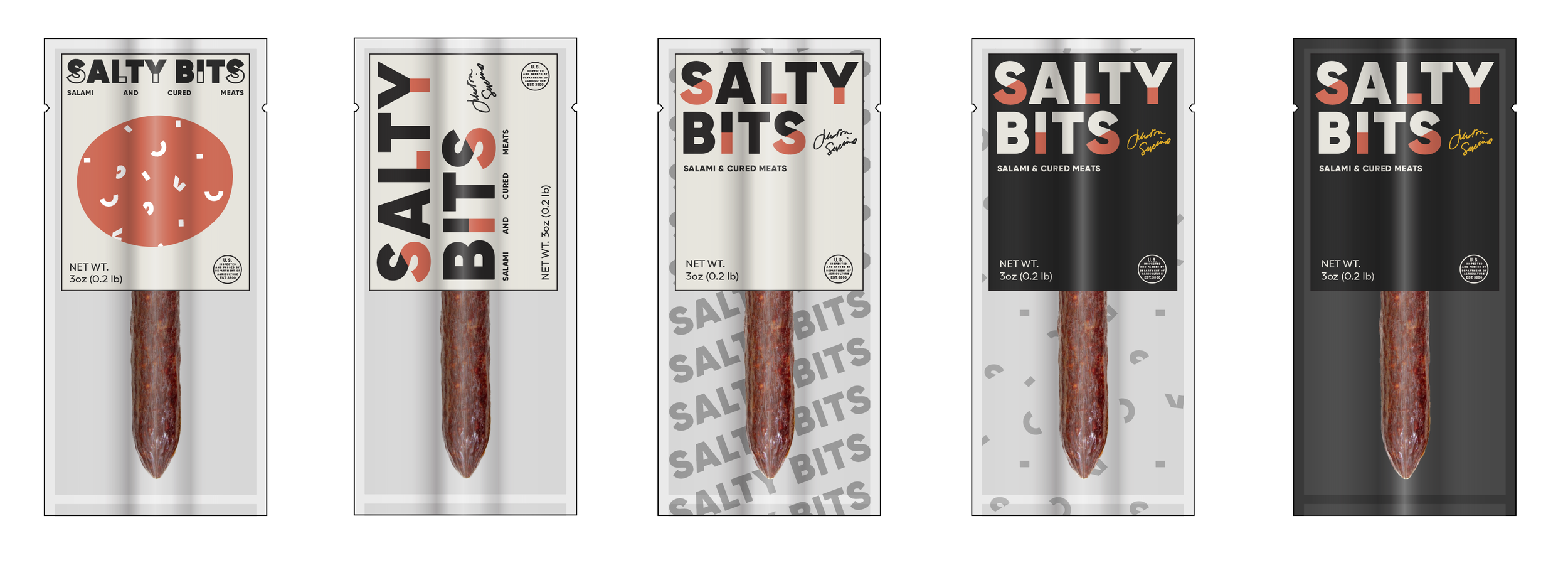
Salty Bits
It started with pork and became a whole lot more. We helped create distinctive and effective packaging for the world’s most expensive sausage made by hand in Pittsburgh, PA.


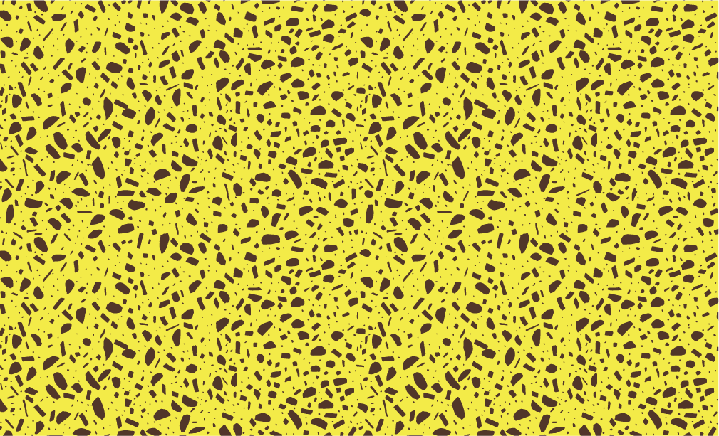
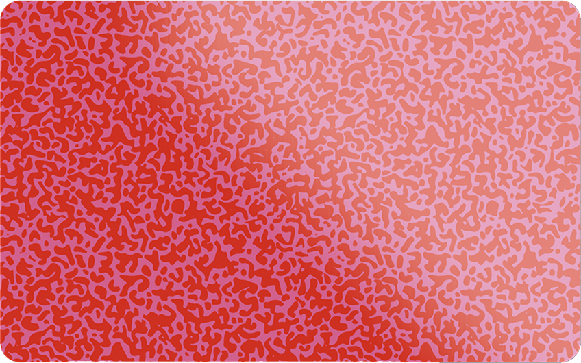
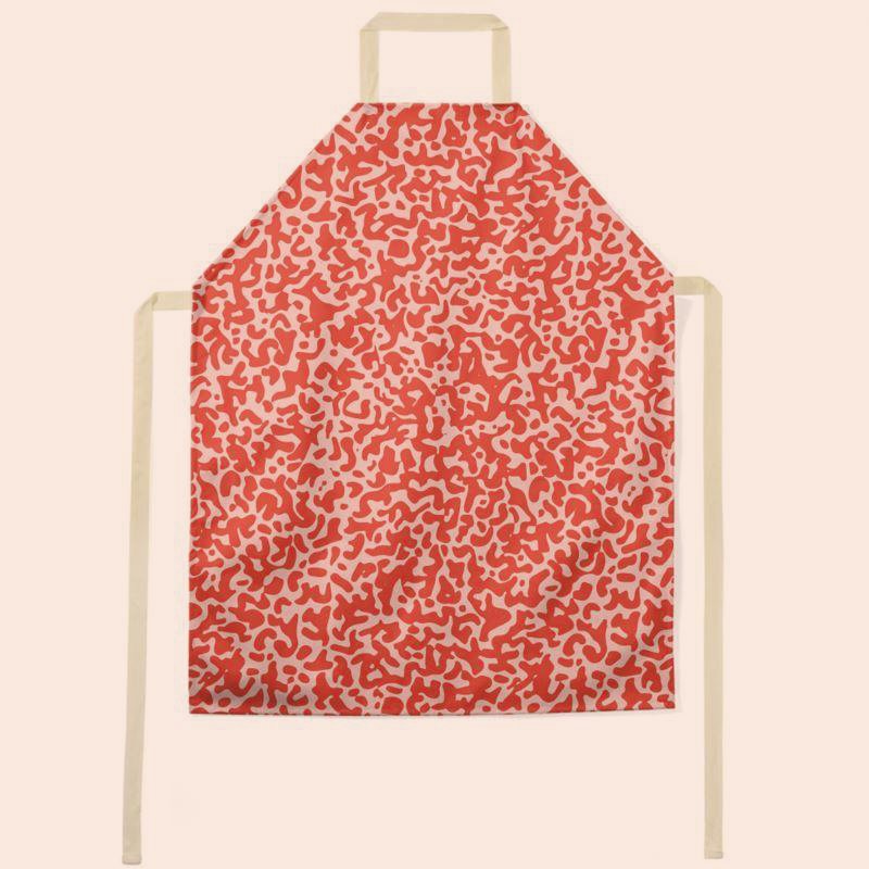
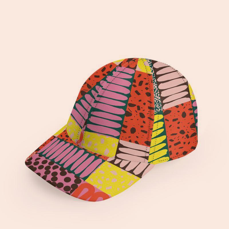
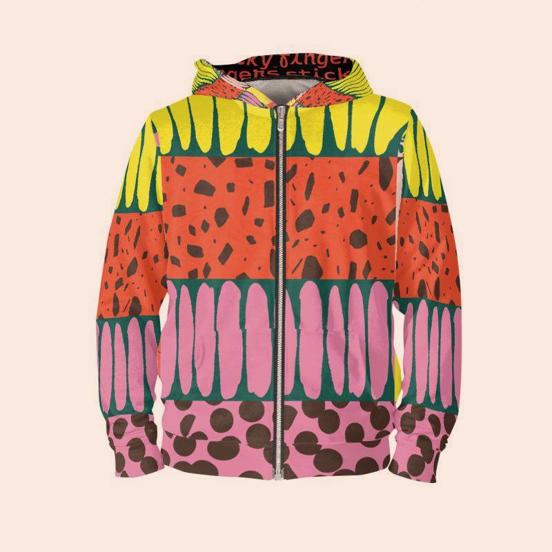
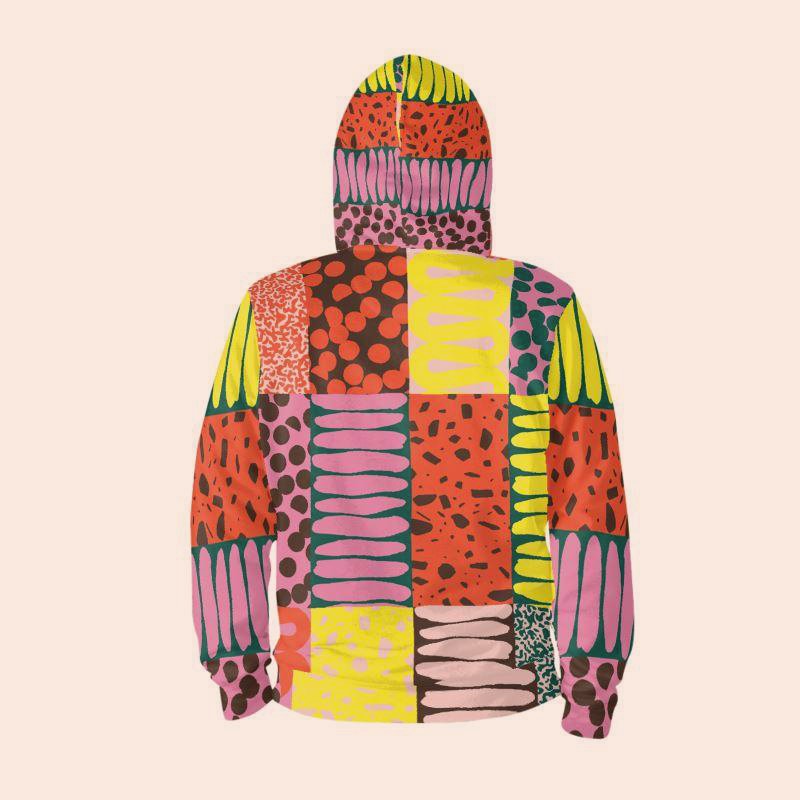
Sticky Fingers
“No butter way to bake a mess” is what we said when we first accepted the opportunity to create a foundation for the next level of growth for a legendary DC-area vegan brand founded by reality baking celebrity Doron Petersan.
Together, we re-imagined Sticky Fingers as a unified and highly visual but also coordinated offering of products and services offered some offered only locally and others nationally, some online while others in brick-and-mortar settings. This means we truly began from scratch.
Starting from the joyful color scheme and friendly typography style the resulting image is accessible, fun, playfully humorous, and inclusive in presentation and tone with an emphasis on delivering bespoke-like luxury and superior performance all while reducing waste and increasing compostability and compatibility with local recycling stream.
Visit the Bakery Website
Visit the Diner Website


A palette that doesn’t take itself too seriously and vibrant graphic patterns that map to product categories work together to create a quirky but accessible DIY mood.


The flexible pouch is a high-resolution medium with a relatively low waste profile. 100% recyclable and modular by design.


Wholesale multi-packs.

The “hat box” for gifting and kits.
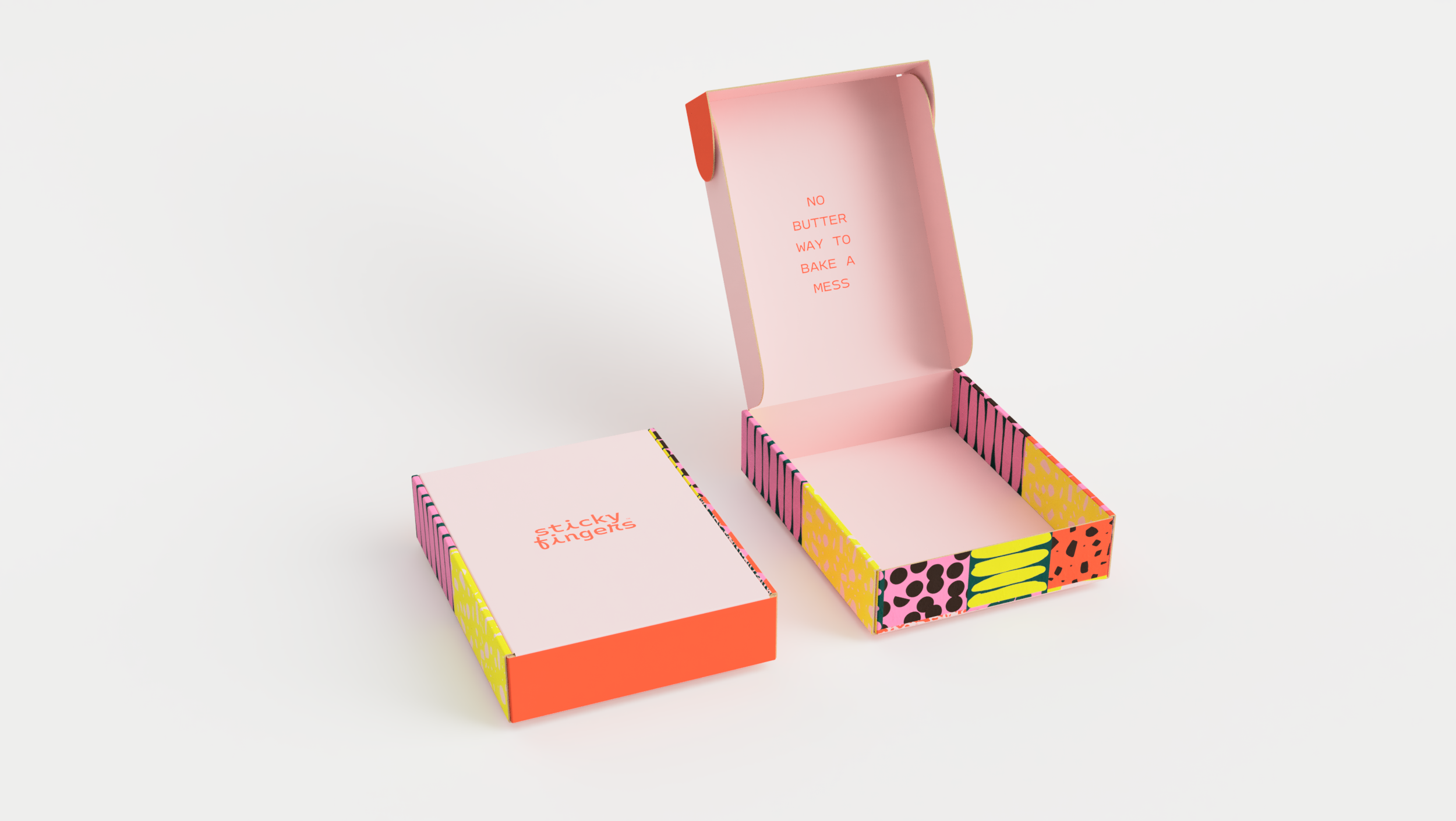
A branded mailer system.
The Sticky Card gift card.


Printed collateral system evokes the nostalgia of old-timey postcards.

Holiday gifting kits. And more!


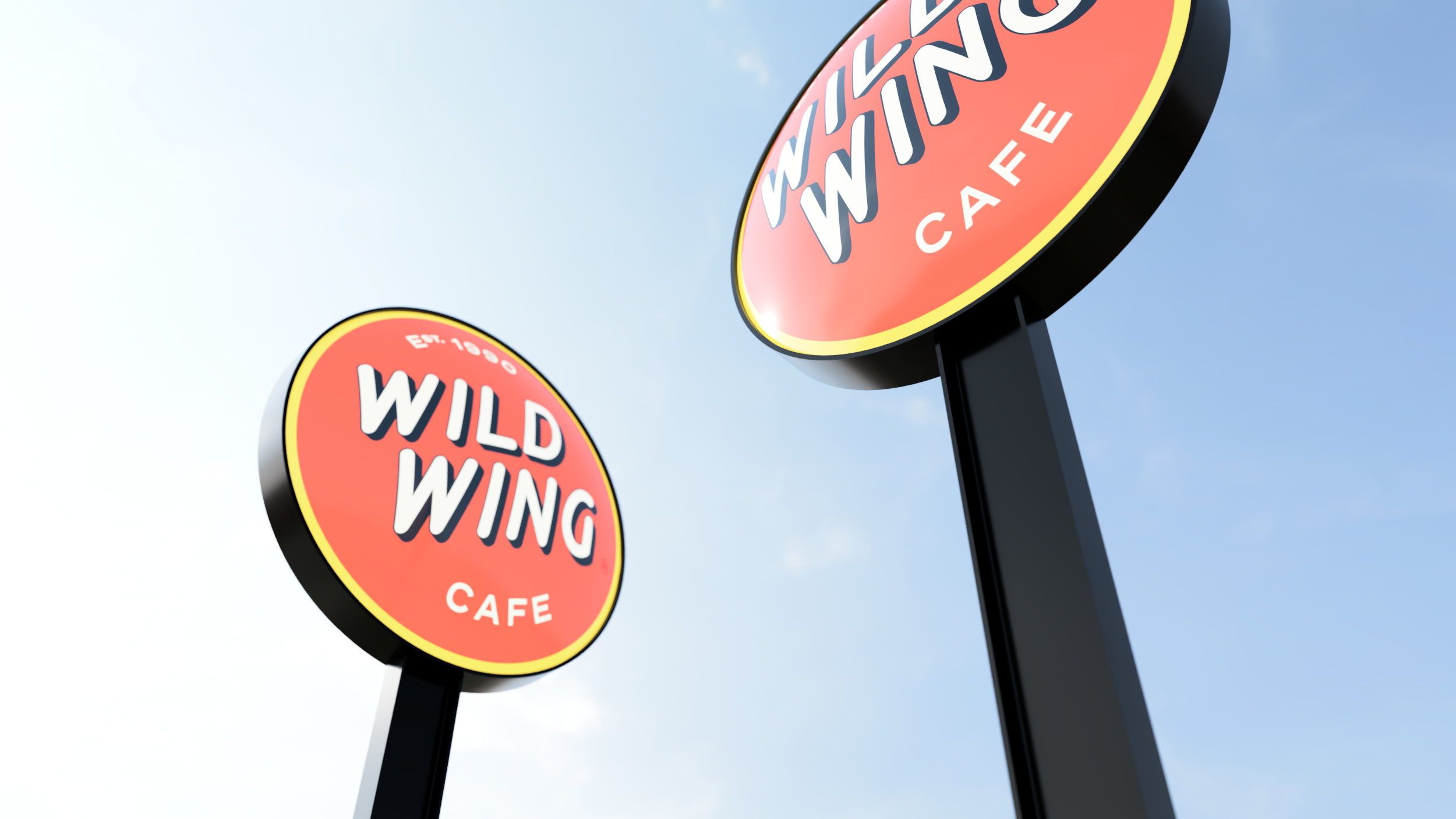
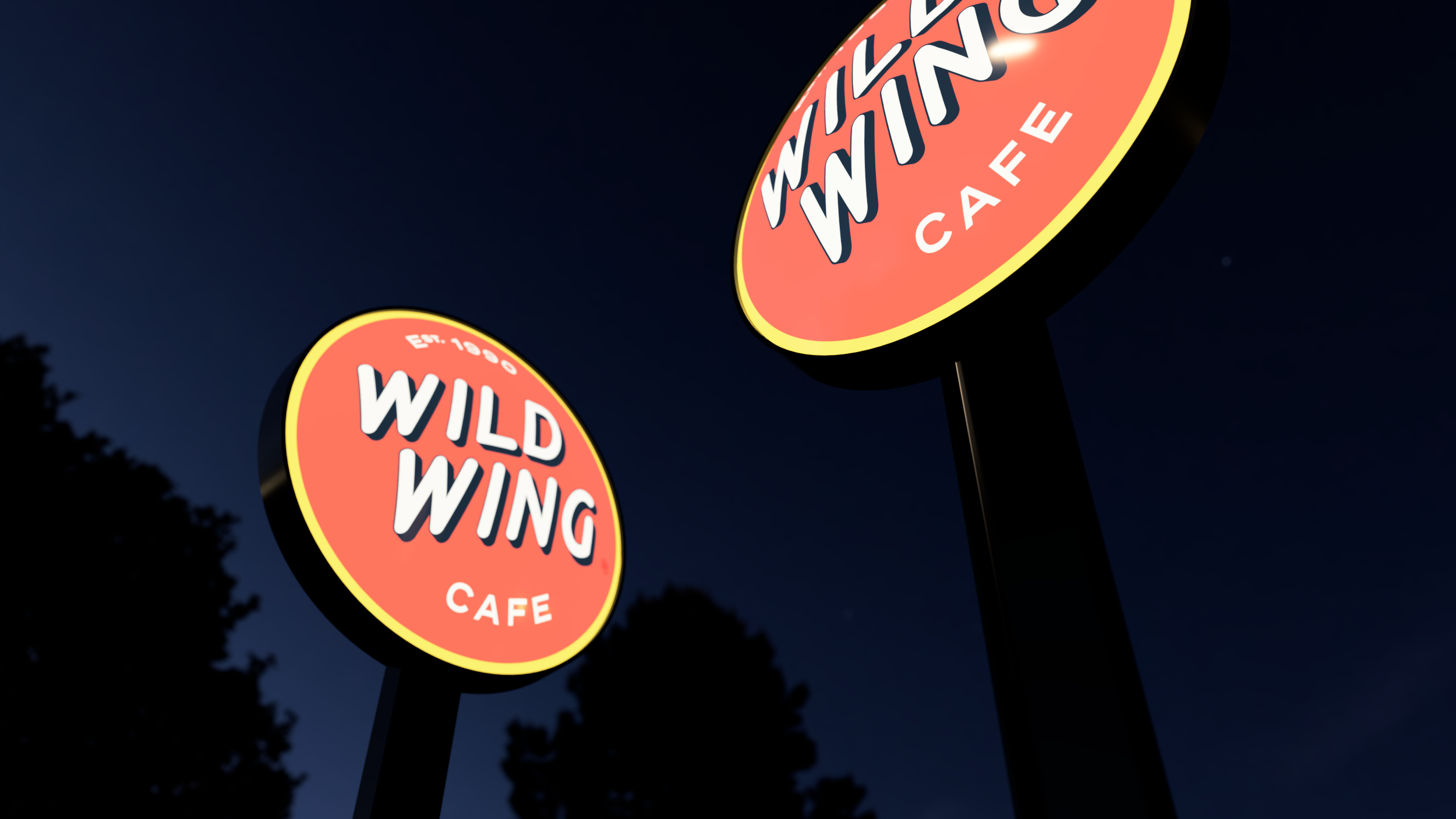
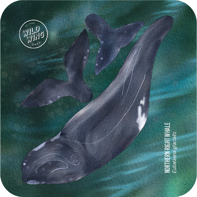
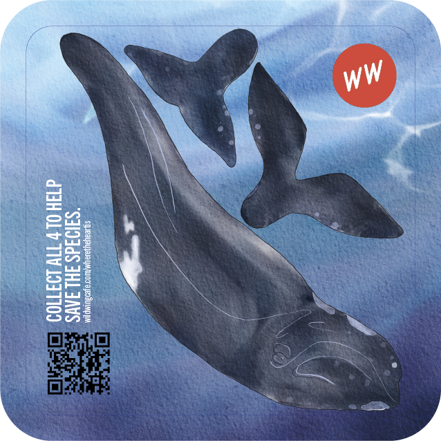
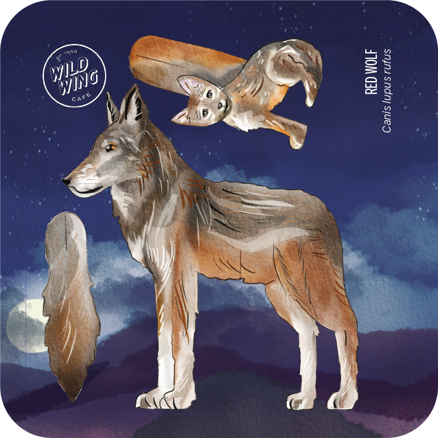
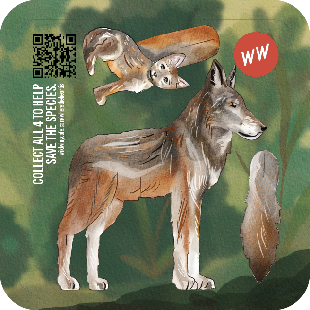
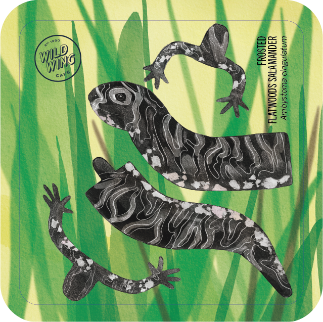
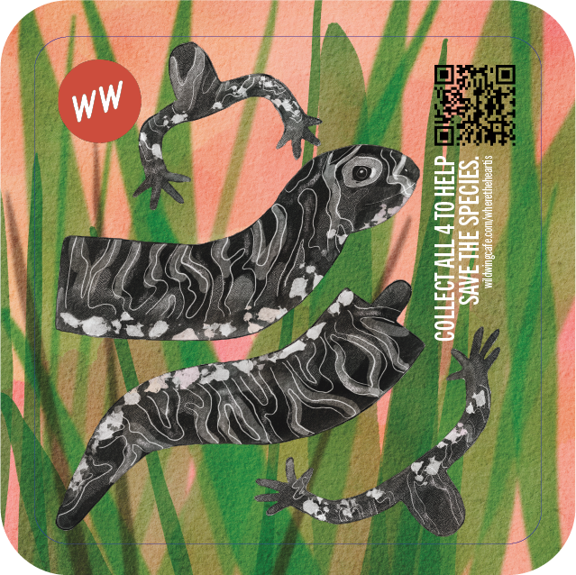
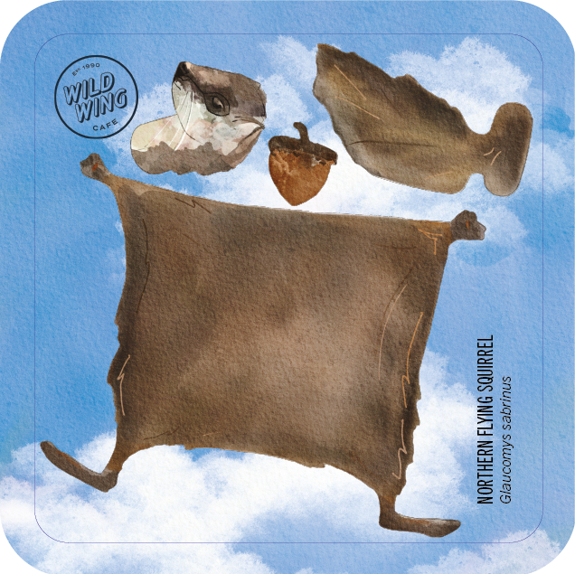
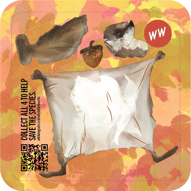
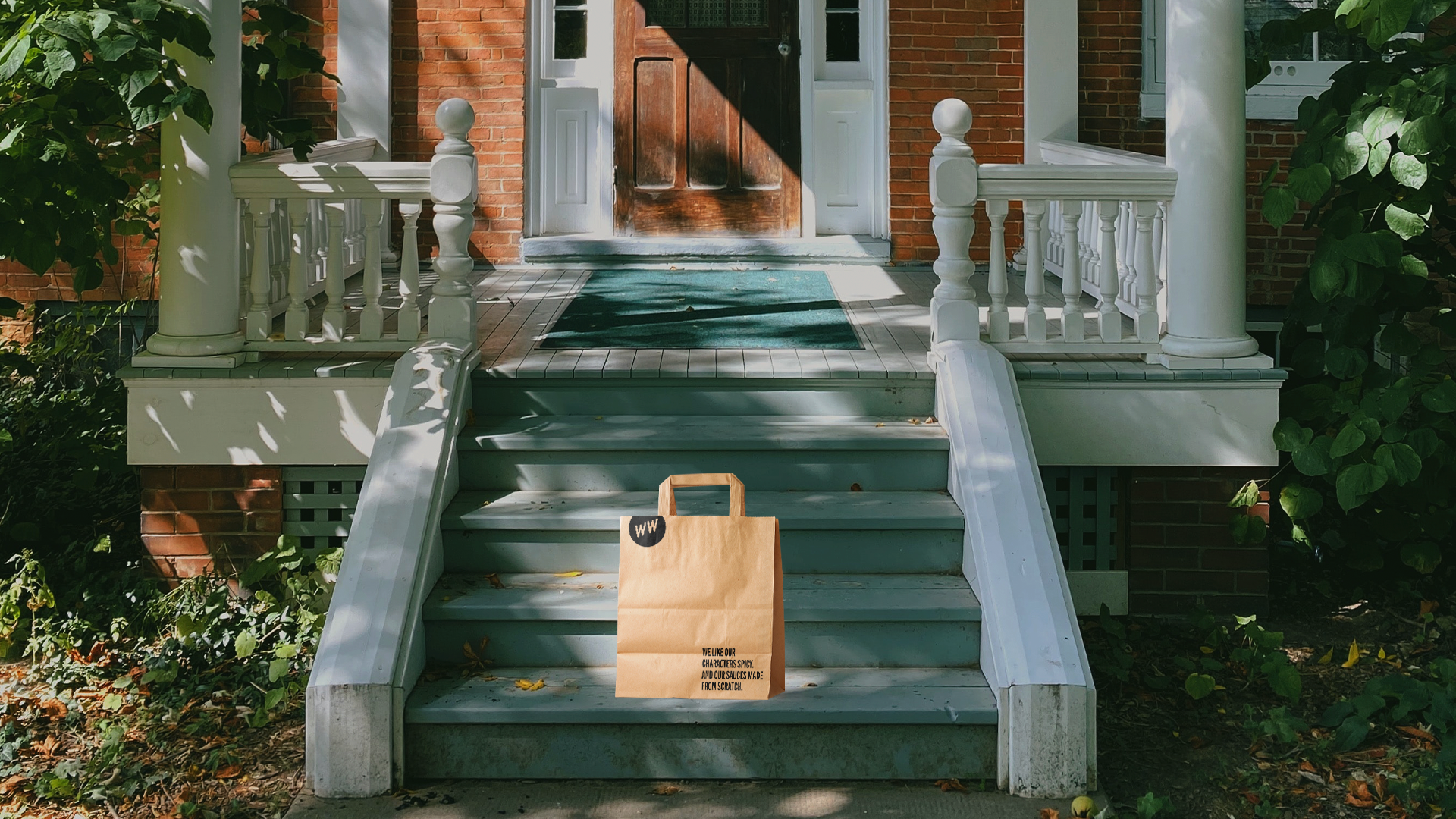
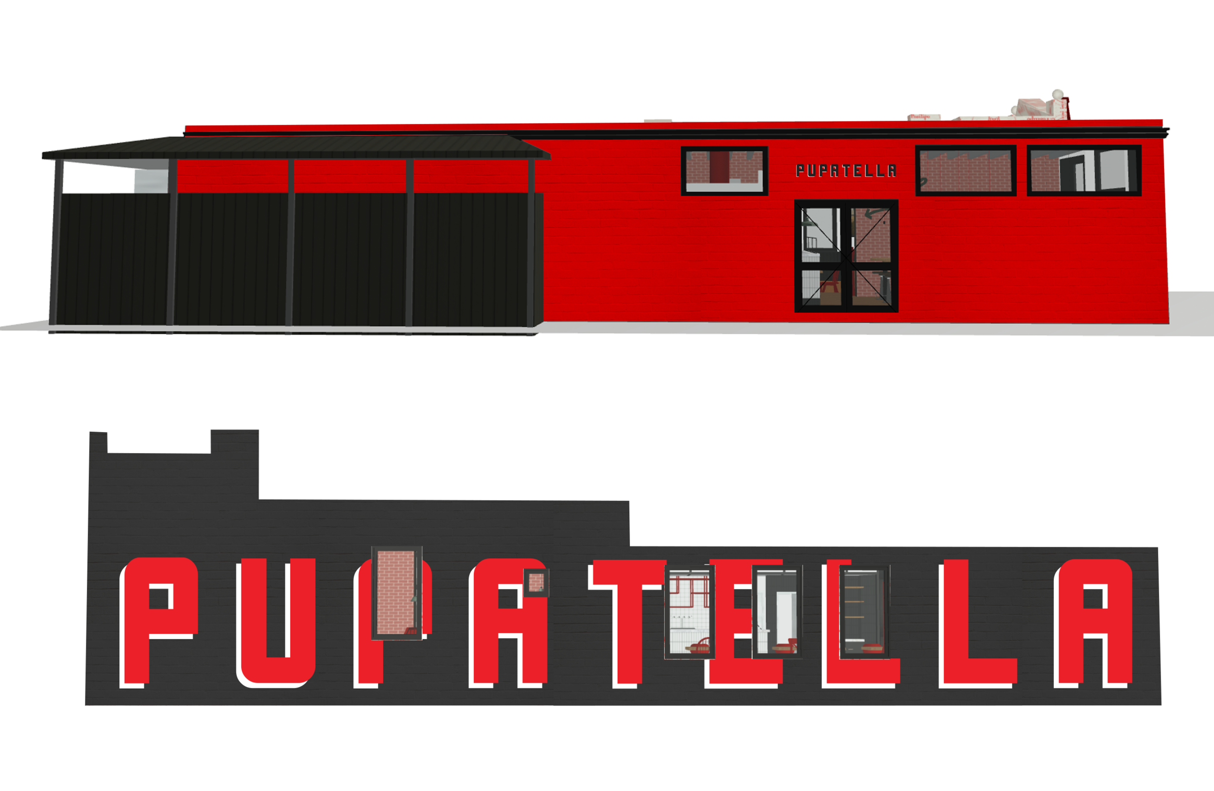
Wild Wing Cafe
Where the wild wings are.
New everything. Rebranded, redesigned, rethought, and a return to course for a NC-headquartered Southern casual bar & restaurant franchise built around freshly baked chicken wings and local live entertainment. We started with devising an updated brand strategy which includes redefined values and brand positioning tagline, as well as, a restated mission and vision statements. Then followed by an aesthetic recalibration and re-imagination of the visual expression from logo to color scheme, the re-establishment of the brand’s purposeful and coordinated voice and tone. ultimately finishing with the environmental store prototype redesign.

As part of activating the new brand strategy, WWC has begun a wholesale conversion to mostly compostable or highly recyclable single-use packaging system.


The reimagined retail exterior prototype includes signature elements such as covered porches and generous outdoor areas as additional subtle expressions of the endemic Southern hospitality.
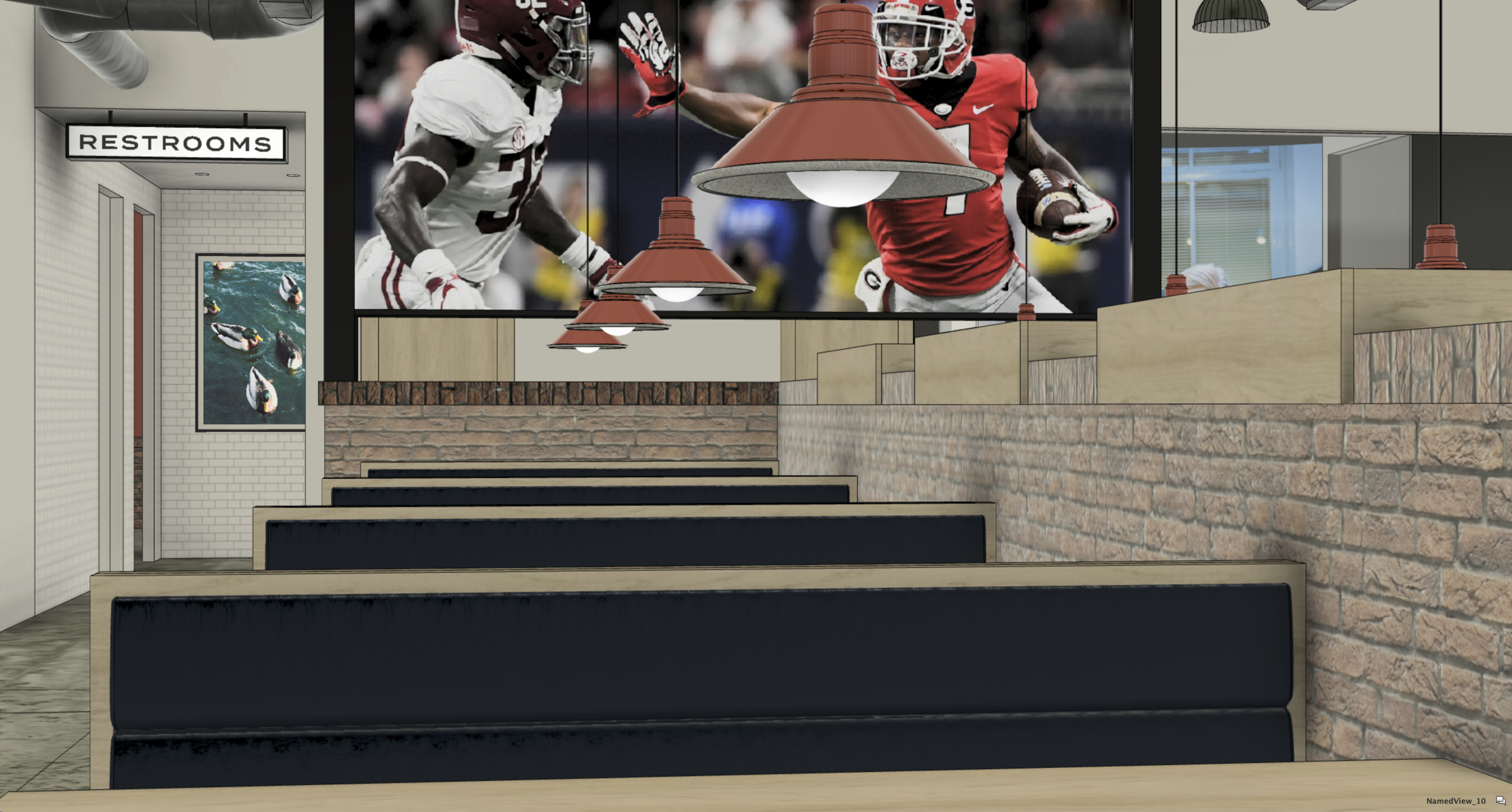
In a radical move that allowed for a significant reduction of clutter by the removal of individual TV monitors we upgraded the customer experience to something more akin to being in an actual living room or even on the bleachers during an actual game. This allows for a clearer distinction between the respective designated zones within the total footprint of the restaurant which enhances the quality of the dining experience for many without removing the ability of others to enjoy a broadcast or a split-screen view of many matches or channels of entertainment in more concentrated fashion.
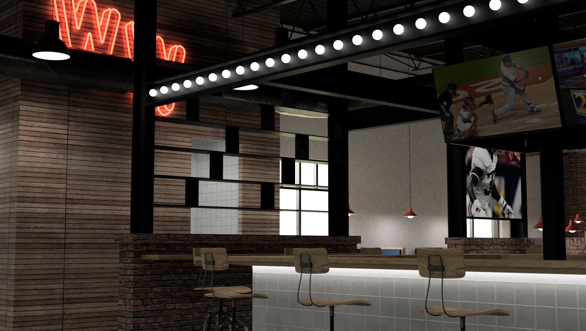

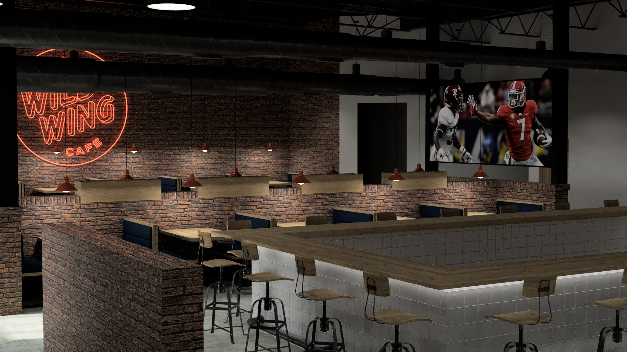
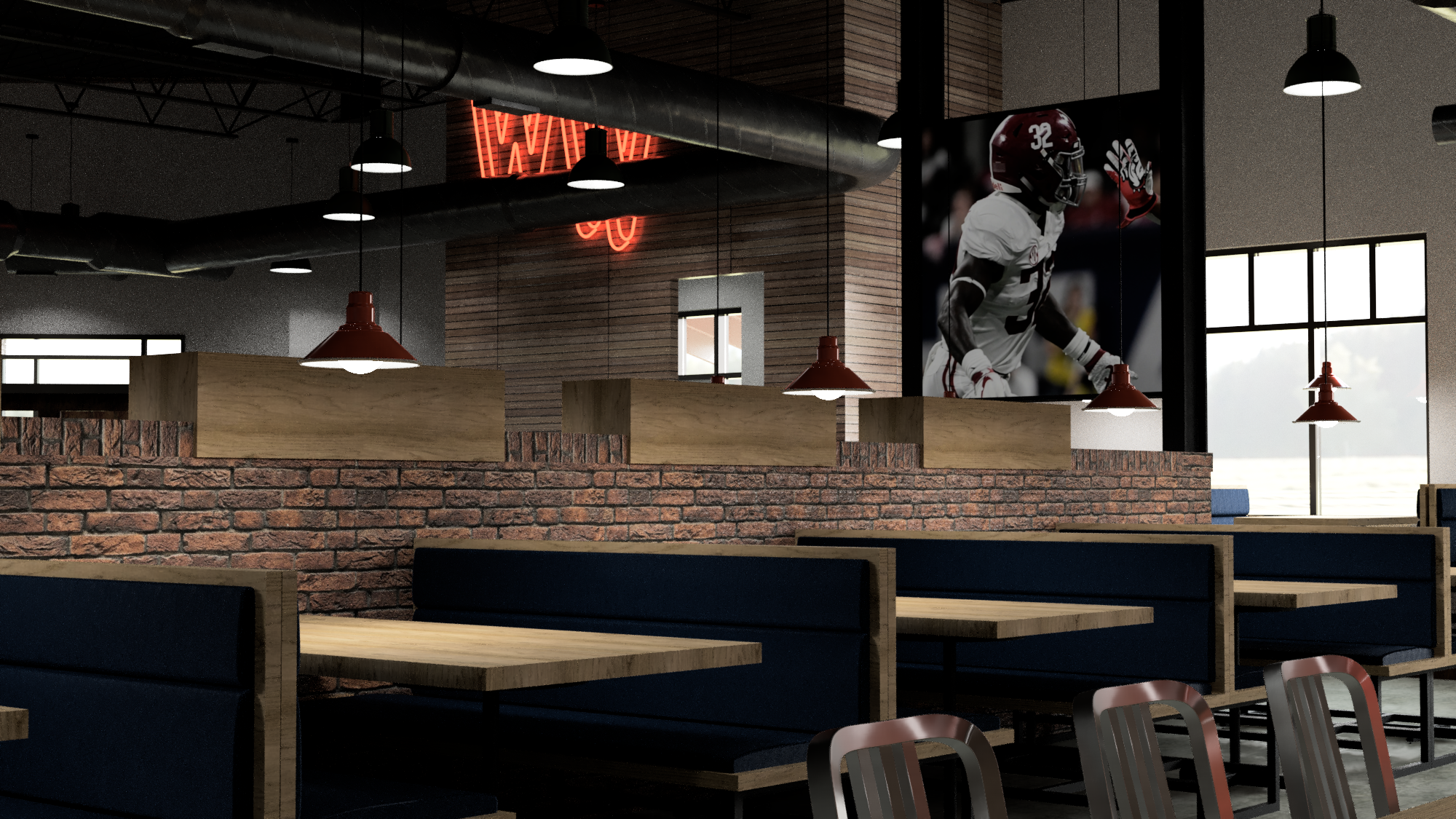
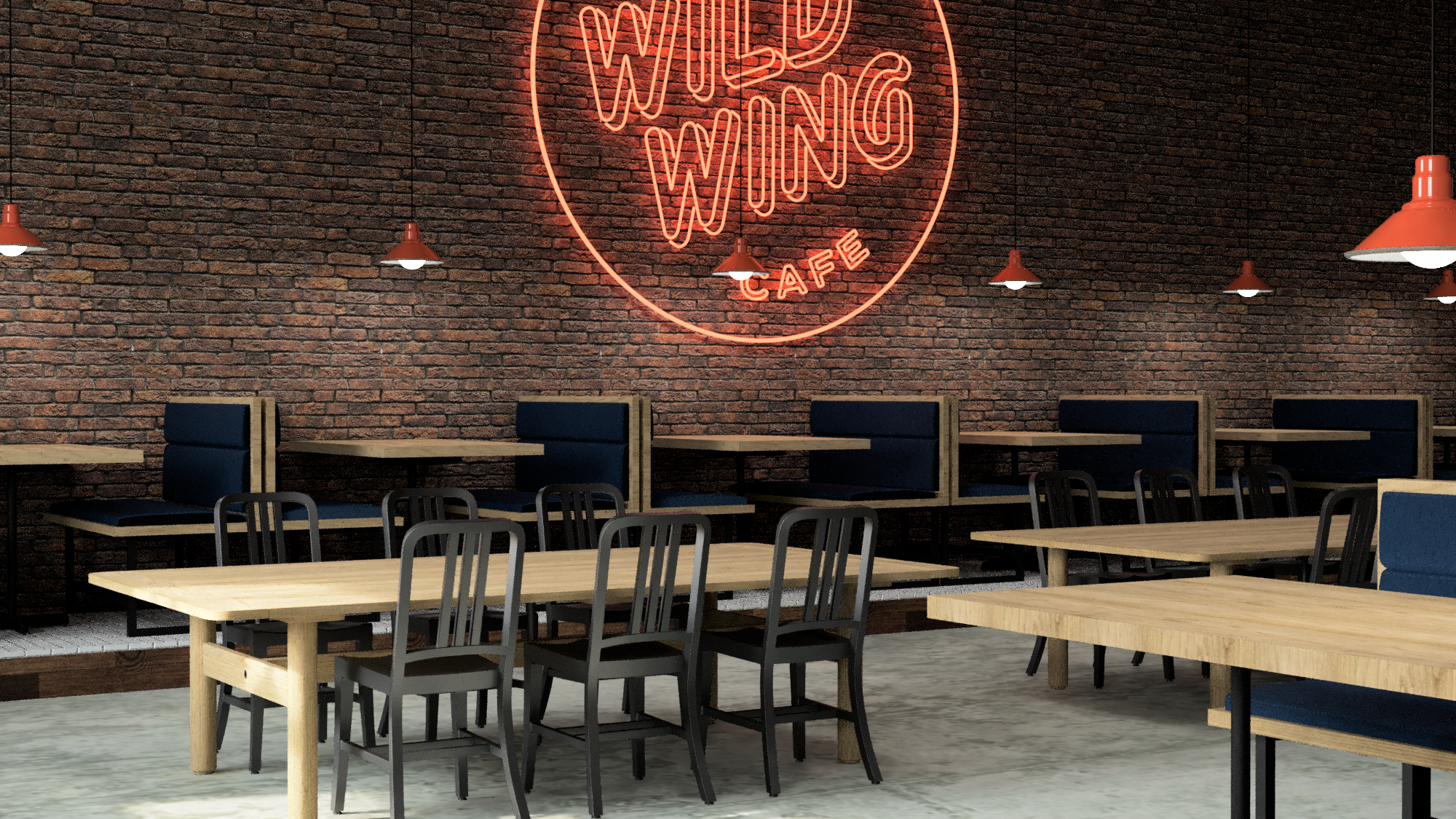

Mixed height furniture and a variety of pendants make for a space that retains depth but also contains interest by enforcing intentional zones within itself.


The new web presence is crisp and to the point and scales well for mobile devices.

A fun, wildly colorful system of adhesive labels for marking the sauce used on wings to go.

The order integrity seal also functions as a way to personalize each item which keeps things organized and friendly at the same time.


The new party box is much, much wilder than ever without losing its sustainable essence or function.

We developed this inexpensive, sustainably and locally made wooden table-top LTO holder system as a way to reduce clutter and bring simple and honest materials back into the every day casual dining experience.

The updated menu system is modular and inexpensive and easy to maintain over long term.


Although rolled out as part of the redesigned children’s Wild Child menu, this is a multi-functional and multiple-audience-oriented beverage coaster that raises awareness about endangered species from the native habitats that coincide with the 43 locations of the WWC. The coasters are 100% compostable and assemble into 3-dimensional sculptures of the respective animal they depict. The embedded QR-code allows for a donation towards the conservation efforts and is connected to the WWC loyalty program.
An excerpt from the brand book.


C3
Introducing the C3 - a Curcumin, Crocus, and CBD Complex. This extraordinary new food supplement with vitamins, choline, minerals, and plant extracts is made by Kannaswiss - a cannabis innovator from Switzerland.

In order to maximize visual and storytelling impact, we devised a solution inspired by the marriage of the naturally occurring color spectrum with the wellness-enhancing promise of “flowing” through one’s day to arrive at a 360-degree labeling solution. The result is effortlessly Swiss while remaining fresh.


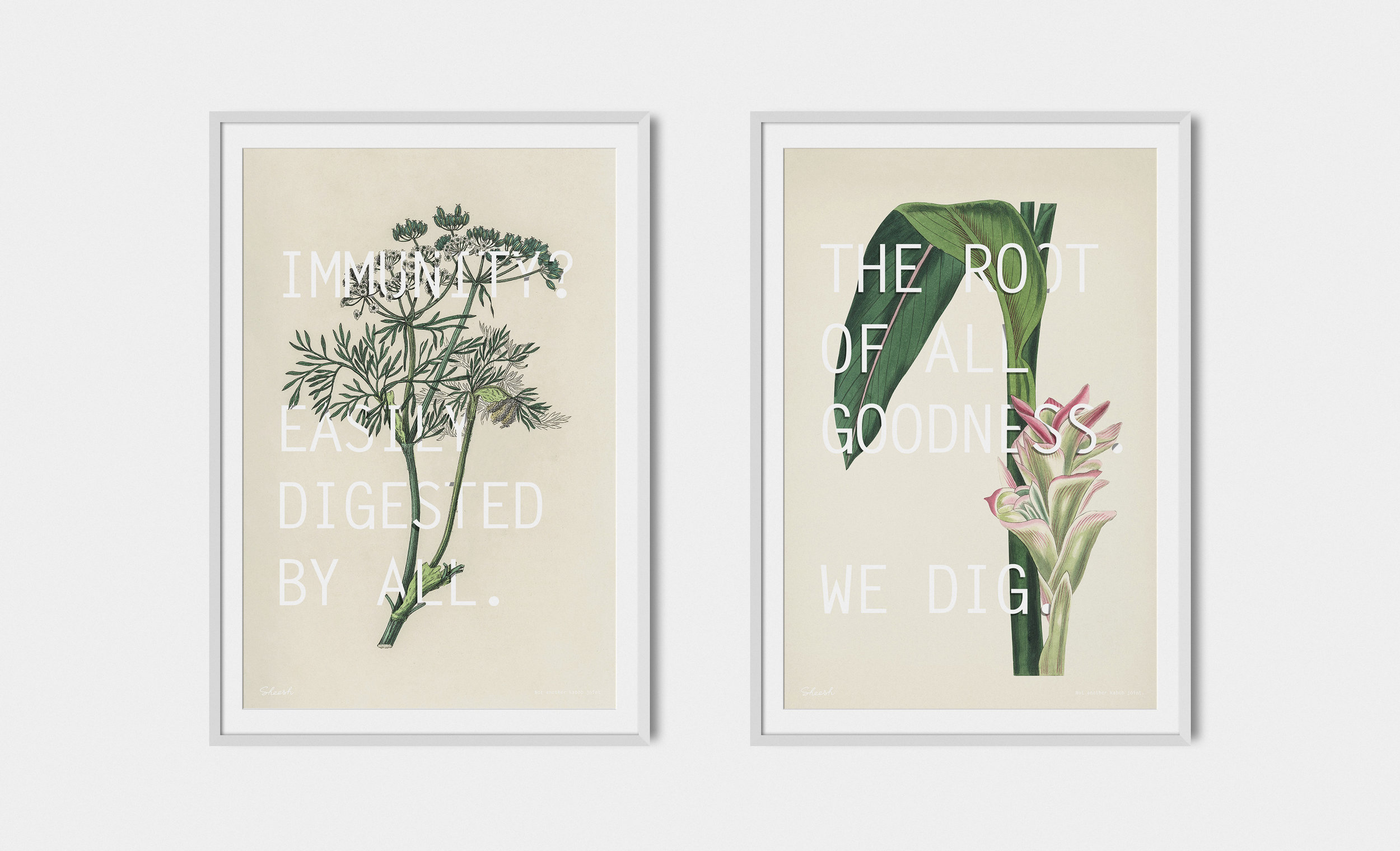
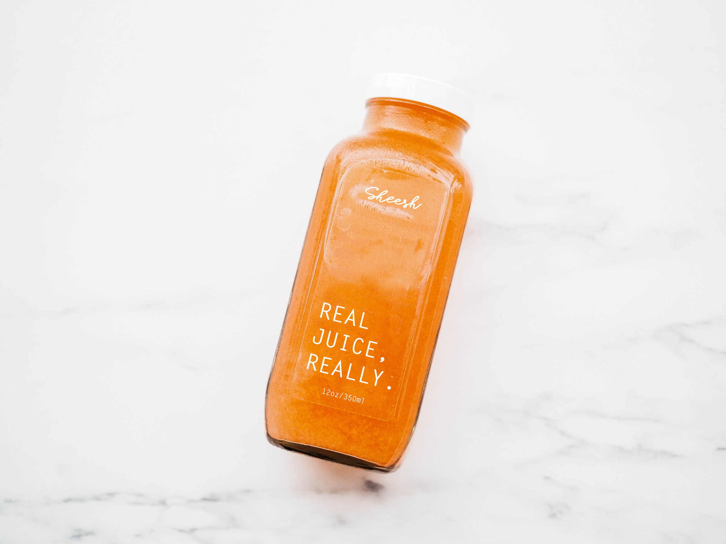
Sheesh
Not another kabob joint! The mandate from the client seemed as clear as it did impossible: To create a unique, contemporary American fast-casual dining experience based on the Afghan-Persian culinary tradition that was not just inclusive of but also attractive to women and families, responsive to modern dietary needs and portion sizes, and distinctly non-ethnic in a way that defies negative stereotyping. Sheesh is launching in the fall of 2018.

The art of grilling is in the DNA of the brand.
Excerpt from the design brief.

A modernized take on the traditional menu.

The brand values of integrity, versatility and agility as represented by the interior finishes.

The logo meanders like a good fairytale from a campground on the Silk Route.

Exterior signage prototype.
Silk road culinary herbs and spices connect the dots between ancient heritage and the contemporary environmental context.

We use humor and attitude to deliver dietary education as part of brand messaging.

A modular menu and messaging wall.

Comfortable and casual, like the cuisine.

Serviceware inspiration.


Shouk
Picture an all-vegetarian Israeli market. We did. Marrying the din of an open air market pita stand with a reliable bag of found objects we created an environment that communicates the essence of the bazaar while providing for a delightful discovery of another side of the greater Middle Eastern cuisine that goes well beyond falafel. Try the cauliflower!

Excerpts from the design inspiration deck.


Functional signage built from scraps.

Window signage.

Keeping a low carbon footprint wherever possible is core to the brand.
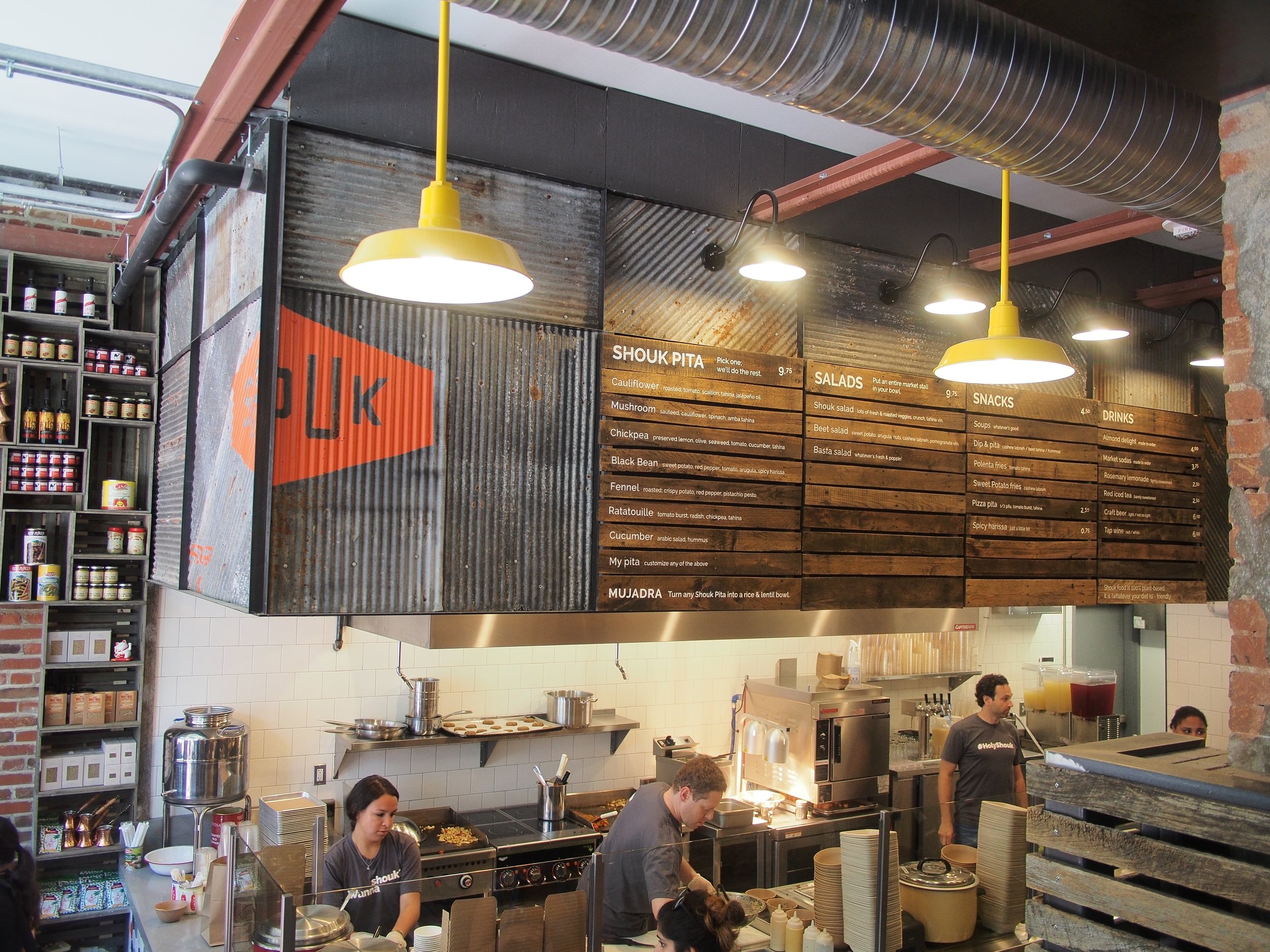
A modular menu system built entirely by hand of found objects.

Dimensionalizing the brand.


CAVA
Together with Peter Hapstak of HD+ we forged a unique identity for this hyper successful fast casual dining brand from suburban Maryland presently taking over the nation.
Ryan Smith was the creative director and producer behind their first piece of video storytelling CAVA: A Culture, Not A Concept.

Sustainability goals are reflected as essential to operations.

Brand messaging embedded.

A customer-friendly ordering process.

Another Cava has been opened to the delight of many.

CHOPT
What had once been one of the most creative salad companies in the world and then lost their focus became whole again after their spiritual and visual face-lift. We brought back the wanderlust and “transportability” as expressions of the brand and the rational foundation on which to both simplify and expand their offering.

Revised logotype absorbed the 90’s throwback runaway chopper with the device user in mind.

A revised manifesto to advertise a renewed commitment to innovation.
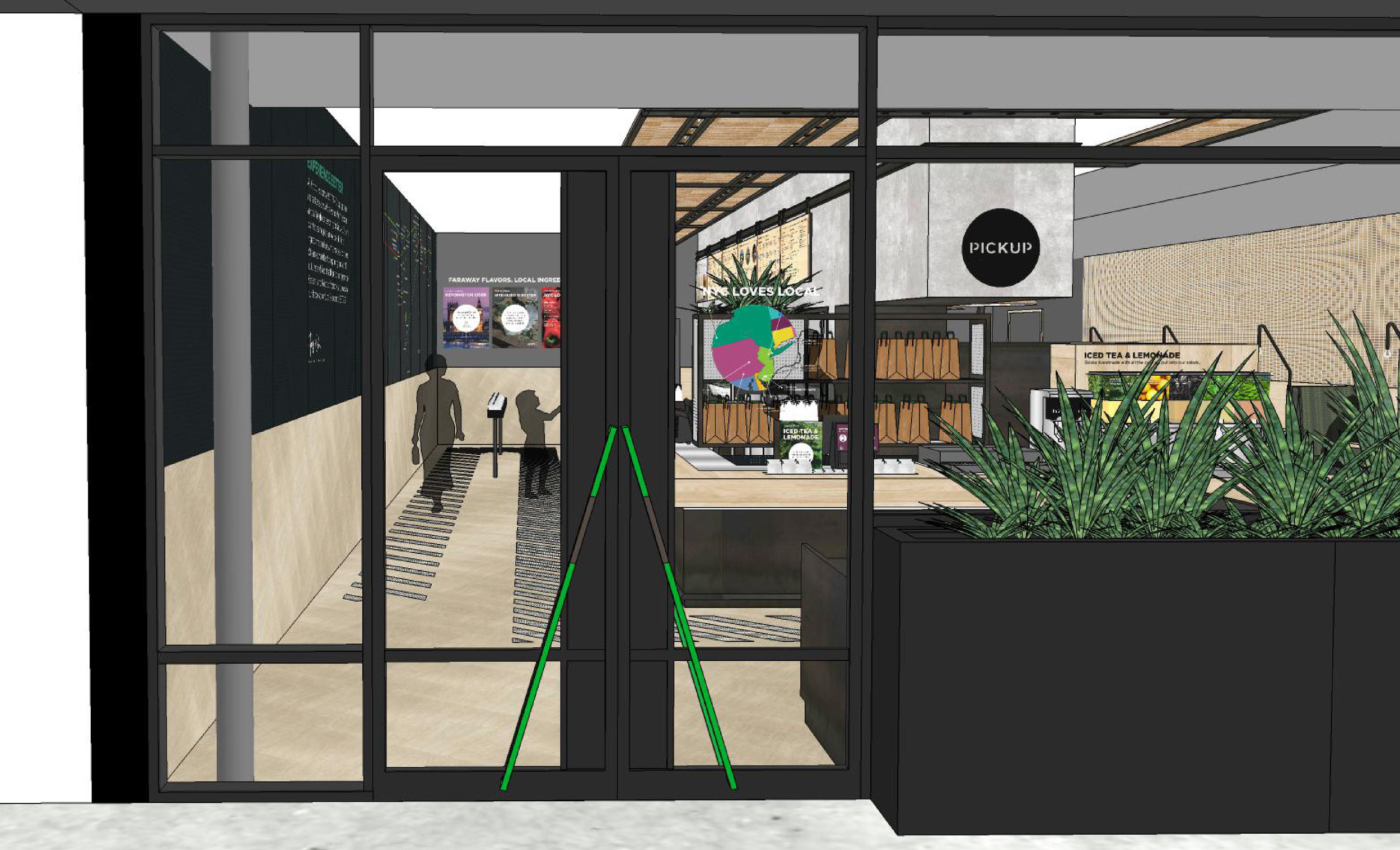
Storytelling begins at the doorstep with a map of suppliers local to a given store.

Modular digital menu system that integrates with POS and brand website.
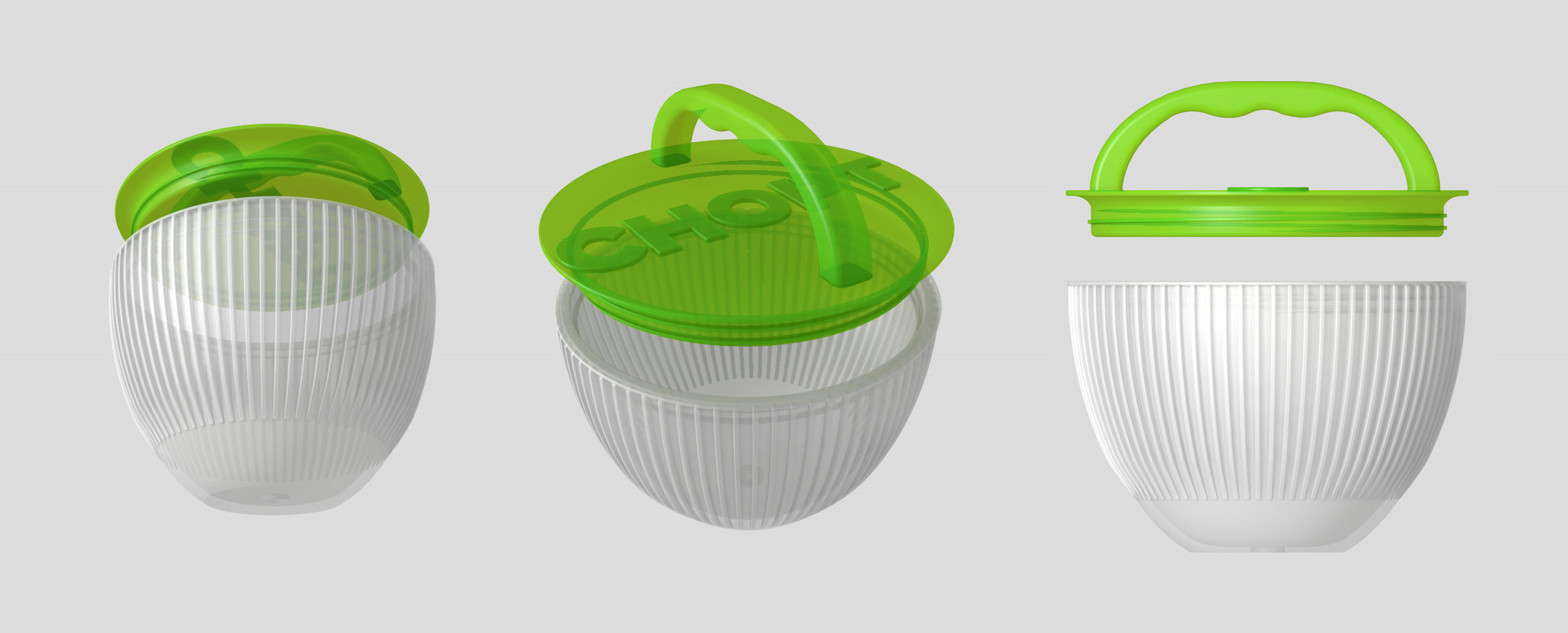
A prototype of an RFID-enabled reusable bowl.

sweetgreen
Sweetgreen brand story video
The spring from whence it all sprung… we did their original brand identity, retail design (in collaboration with CORE Architecture & Design), digital and visual storytelling for several years to prepare Sweetgreen for national expansion. The videos including “meet the farmer” series, sweetlife sessions, sweetlife festival branding + doc, and individual digital releases were directed + produced by our own Ryan Smith.
Sweetpress introductory campaign video.

Sweetlife music and food festival full length documentary.