We draw on extensive global experience and human intelligence combined with the latest AI tools to create, nurture and dimensionalize your brand, product, service, or experience.

Strategy
We’re diligent researchers and creative thinkers. Getting to know our clients starts with a competitive landscape assessment, business goals refinement, and progresses to unique value proposition development, brand strategy, design strategy, and functional or material requirements, and roadmap development.

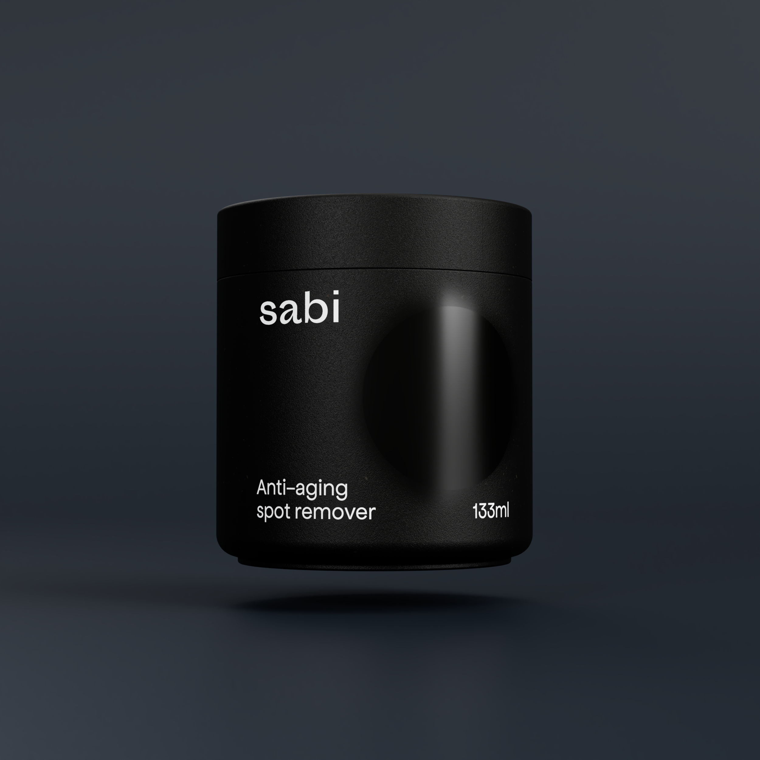
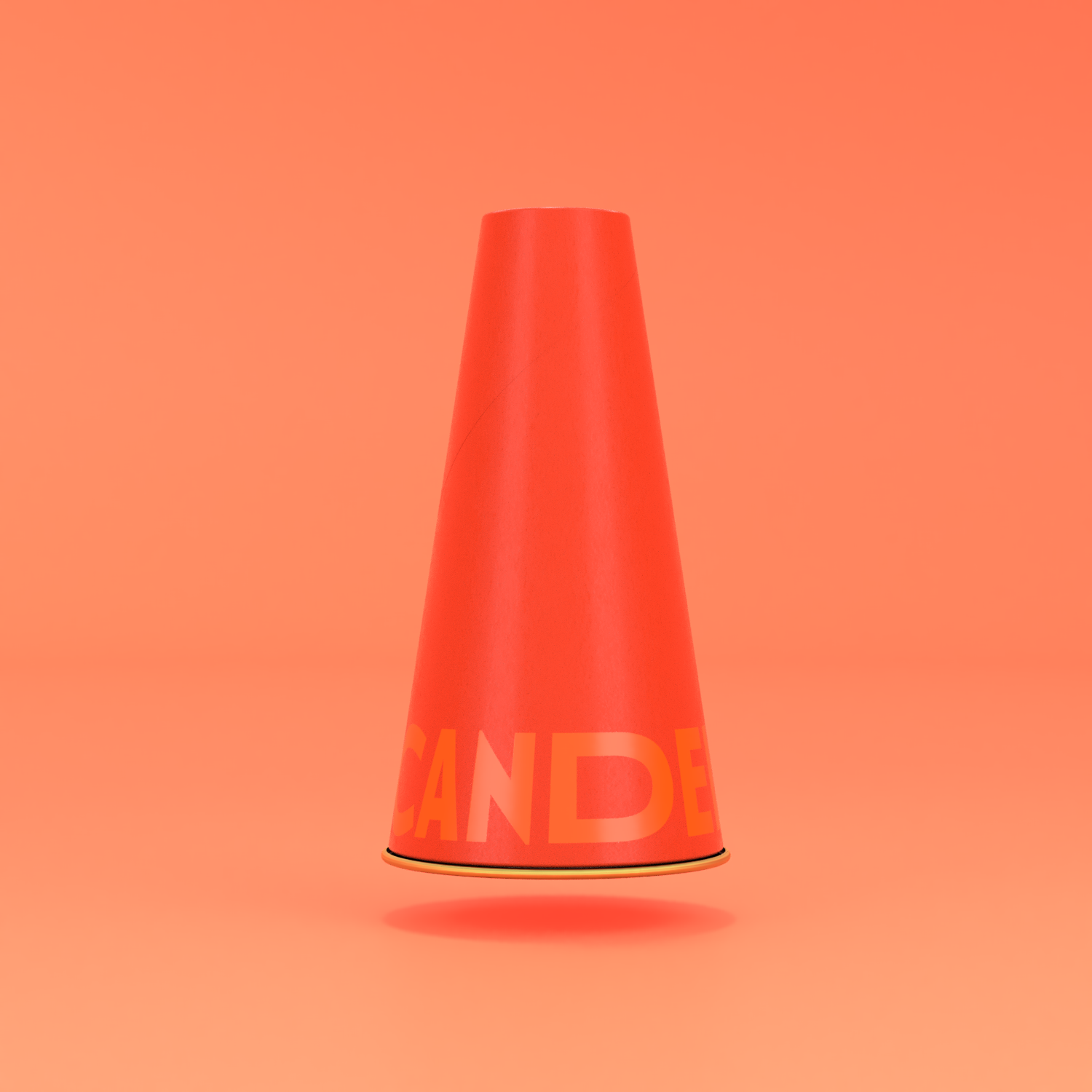
Design
We’re creative makers. From the creative brief, brand identity and visual design, product packaging and identity design, CPG product design, environmental design, and digital product, website, and app UX/UI, we like to think of design as a holistic toolkit for the needs of the brand, product, or service.

Storytelling
We’re a customizable, creative production house. Scripting + copywriting, videography, still photography, animation, post-production from voiceover recording to musical composition scoring… we do it all to get your brand or product launched right.